SNAG
branding, packaging|effortless living brand, compressed furniture|snag
branding, packaging|effortless living brand, compressed furniture|snag


SNAG is a lifestyle brand that redefines the furniture experience through compressed sofas. We led the entire brand process—from identity and positioning to packaging design.
By redefining the heavy and cumbersome experience of traditional furniture into the intuitive “tear, pull out, and unfold” interaction unique to compressed sofas, we transformed the moment of installation into an enjoyable experience.
Through a light and playful experience—like opening a snack—SNAG aims to turn everyday moments into more delightful times. Under the message “SNAG IT YOUR WAY,” the brand encourages users to enjoy their space and time in their own way, creating a richer everyday life.
SNAG’s design focuses on visually expanding the experience inspired by the moment of opening a snack. A diagonal motif, derived from the act of tearing open a package, is established as the key visual and applied across the logo, typography, and overall brand system to express rhythm and energy. The packaging is designed as a cohesive experience sequence, extending the sense of enjoyment from the first encounter to the final moment of product completion.
스내그는 압축 소파를 기반으로 새로운 가구 경험을 제안하는 라이프스타일 브랜드이다. 우리는 아이덴티티부터 포지셔닝, 패키지에 이르는 전 과정을 총괄 디자인하였다.
기존 가구 시장의 무겁고 번거로운 경험을 ‘뜯고, 꺼내고, 펼친다’는 압축 소파만의 직관적인 사용 경험으로 재정의하고, 설치의 순간을 하나의 즐거움으로 확장하였다.
과자를 뜯듯 가볍고 즐거운 경험을 통해, 일상을 유쾌한 시간으로 전환하고자 한다. ‘SNAG IT YOUR WAY’라는 메시지 아래, 각자의 방식으로 공간과 시간을 즐기며 더 풍부한 일상을 만들어가도록 제안한다.
스내그의 디자인은 ‘과자를 뜯는 순간’의 경험을 시각적으로 확장하는 데 집중하였다. 봉지를 가볍게 찢는 형태에서 착안한 사선 모티프를 키 비주얼로 설정하고, 이를 로고와 타이포그래피, 전반적인 브랜드 시스템에 적용해 리듬감과 에너지를 더했다. 패키지는 하나의 경험 시퀀스로 설계되어, 제품을 마주하는 순간부터 완성에 이르는 과정까지 유쾌한 경험이 이어지도록 구성했다.
NUCHEAT
branding, packaging|wellness lifestyle brand, protein shake|natiko
branding, packaging|wellness lifestyle brand, protein shake|natiko
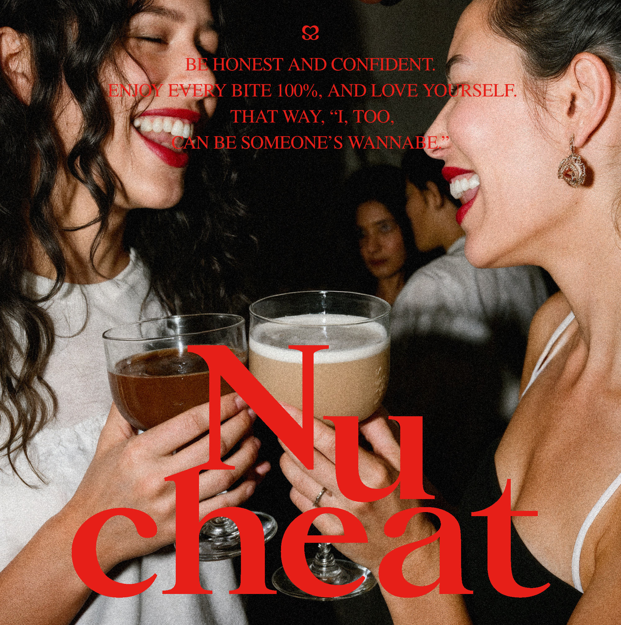
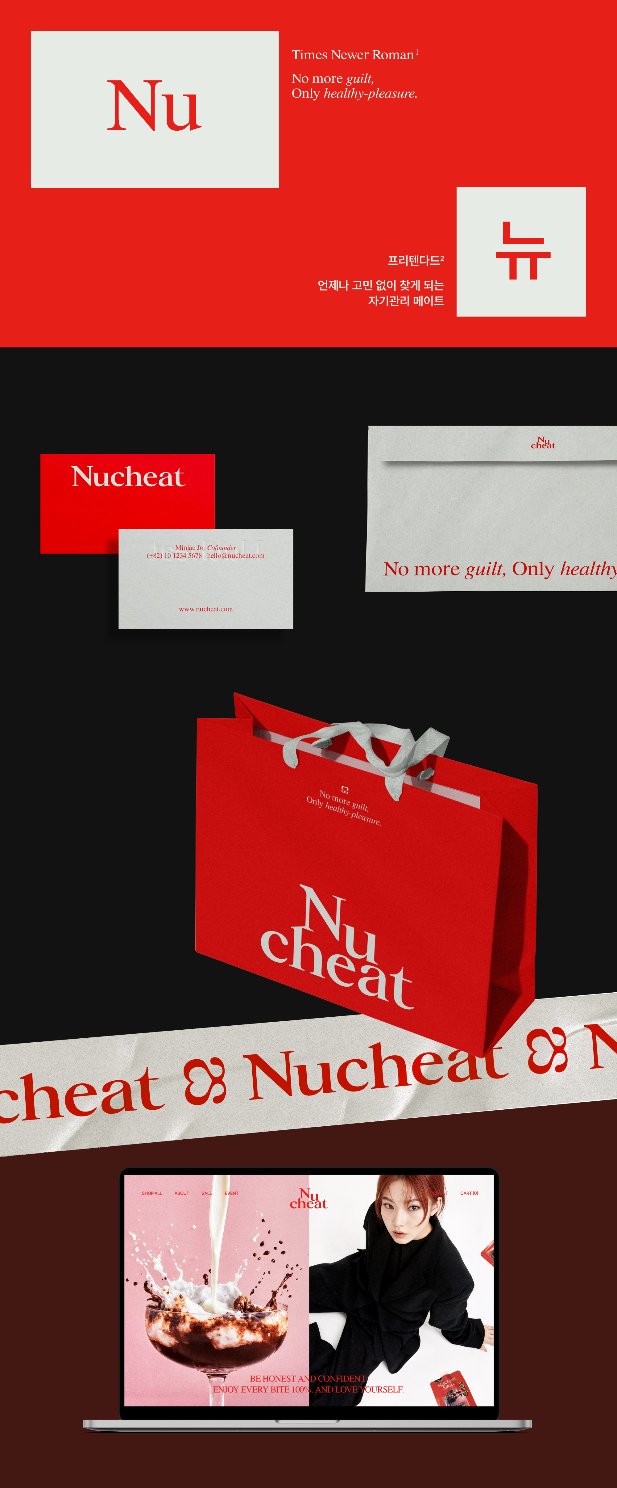
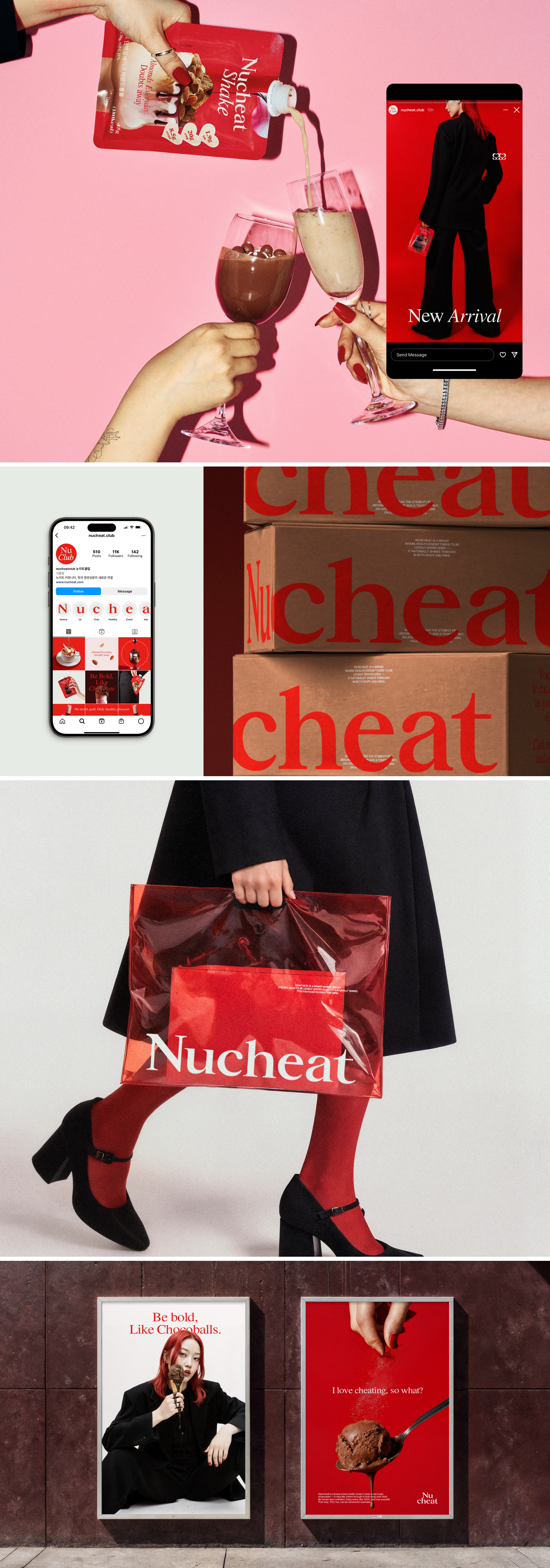
Newcheat is a wellness lifestyle brand developed for entry into the protein shake market. We led the entire branding process — from naming, identity, and positioning to the packaging design of its first product lineup.
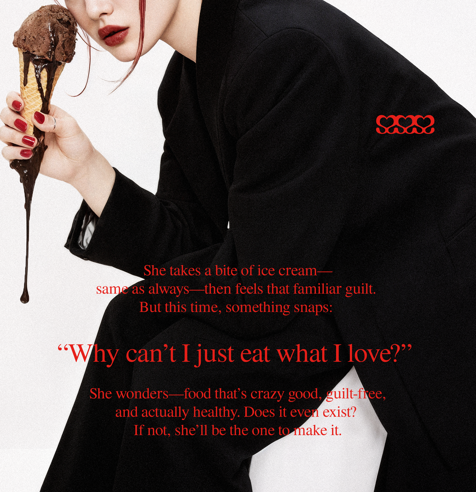
While “sweet and tasty” may seem like a simple product feature, we saw it as more than that — a chance to shift the narrative around dieting itself.
Instead of accepting the conventional, guilt-driven mindset, we reframed it through a brand lens: into one of joyful, confident, and self-directed care.
The brand philosophy is rooted in encouraging people to break free from the guilt often tied to “forbidden” foods during dieting, and to embrace what they love without hesitation.
This message is delivered through a fictional persona, “Her,” whose witty voice makes the brand feel approachable and relatable, offering both a sense of belonging and motivation.
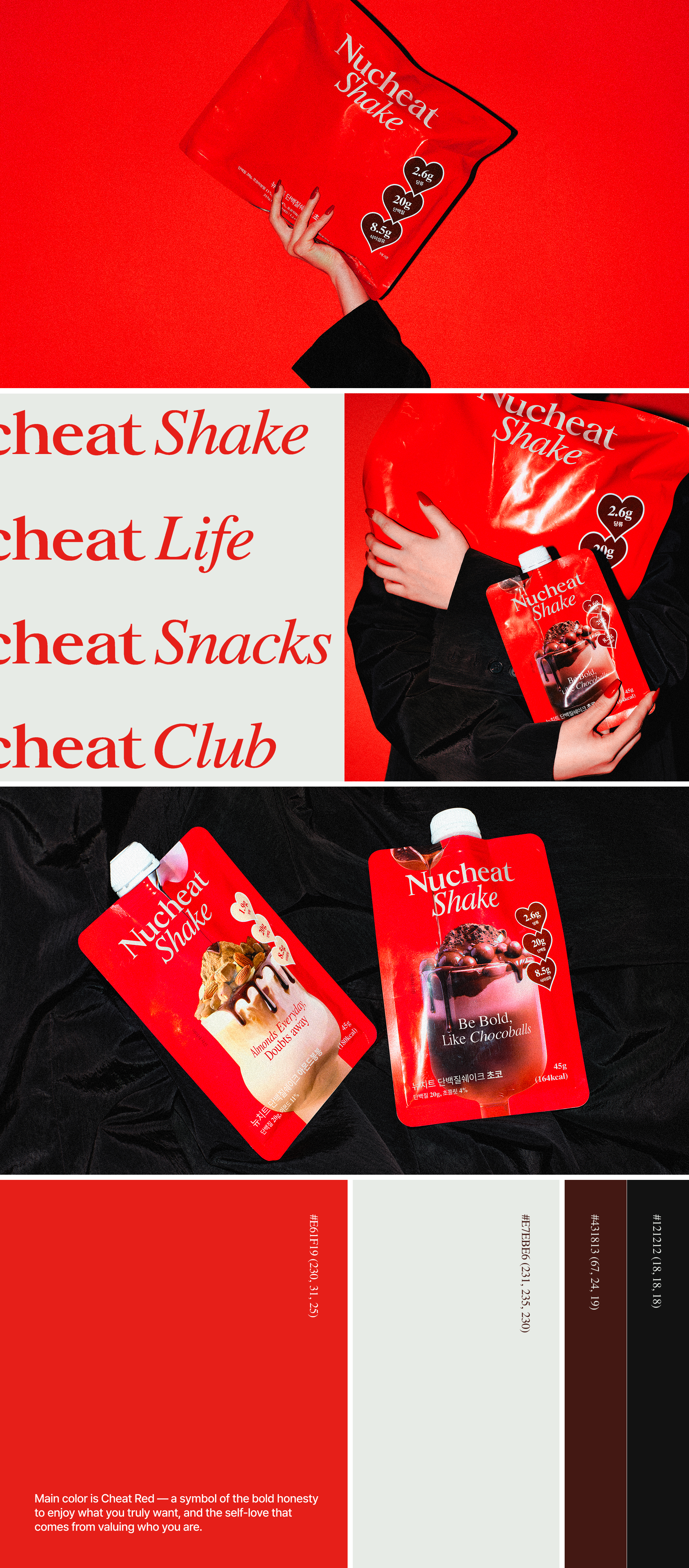
Newcheat’s bold and stylish identity is expressed through its edgy logo and signature color, Cheat Red.
Its protein shake reinterprets the challenge of giving up dessert, offering indulgent flavor while maintaining nutritional balance.
This approach is visualized through dessert-inspired packaging and playful messaging that reflect the brand’s confident personality.
While “sweet and tasty” may seem like a simple product feature, we saw it as more than that — a chance to shift the narrative around dieting itself.
Instead of accepting the conventional, guilt-driven mindset, we reframed it through a brand lens: into one of joyful, confident, and self-directed care.
The brand philosophy is rooted in encouraging people to break free from the guilt often tied to “forbidden” foods during dieting, and to embrace what they love without hesitation.
This message is delivered through a fictional persona, “Her,” whose witty voice makes the brand feel approachable and relatable, offering both a sense of belonging and motivation.
Newcheat’s bold and stylish identity is expressed through its edgy logo and signature color, Cheat Red.
Its protein shake reinterprets the challenge of giving up dessert, offering indulgent flavor while maintaining nutritional balance.
This approach is visualized through dessert-inspired packaging and playful messaging that reflect the brand’s confident personality.
뉴치트는 단백질 쉐이크 시장 진입을 위해 기획된 웰니스
라이프스타일 브랜드이다. 우리는
네이밍, 아이덴티티, 포지셔닝, 첫 제품인
프로틴 쉐이크
패키지까지 브랜드 전 과정을 총괄 디자인하였다. ‘달고 맛있다’는 단순한 제품 특징이지만, 우리는
이를 식단 관리에 대한 부담스러운 인식을 ‘즐거운 자기 관리’로 바꾸는
브랜드적 해석으로 접근하였다.
브랜드 철학은 다이어트 중 금기시되는 음식에 대한 죄책감에서 벗어나, 원하는 것을 당당히 즐기는 용기와 해방감을 전하는 것이다. 이 메시지는 가상의 인물 ‘그녀’의 위트 있는 말투로 전달돼 소비자에게 친근하게 다가가며 소속감과 동기를 부여한다.
자신감 있고 세련된 무드는 엣지 있는 로고와 ‘치트 레드’ 컬러로 드러나며, 뉴치트의 당당한 개성을 표현한다. 식단 관리 중 디저트 포기를 새롭게 해석한 단백질 쉐이크는 속세의 맛에 대한 갈망을 충족시키면서도 영양 밸런스를 유지한다. 이는 패키지를 통해 디저트 같은 비주얼과 위트 있는 문구로 시각화되었다.
SAI
reinterpretation project | branding, spatial |public restroom
reinterpretation project | branding, spatial |public restroom


SAI is a project that reimagines public restrooms—once perceived as isolated islands within the city—into true public spaces where anyone can pause and rest. Inspired by the daechung maru, a traditional Korean communal platform embodying collective values, the project transforms a purely functional space of necessity into a “considerate platform” where people can share rest and moments of connection.
The spatial design reinterprets three essential qualities of the maru through a contemporary architectural language. ‘Lift’, which separates the roof to create airflow, functions as a device for sharing comfort. ‘Permeation’, expressed through translucent materials, captures natural light during the day and transforms into a soft lantern that illuminates the city at night. ‘Extension’, where the platform stretches outward, becomes a small resting place where anyone can sit and pause. These distinct spatial elements are gently unified under a single, fluid roof.
Upon entering, light and sky filter through the gaps in the roof, creating an open atmosphere as if one were within nature. The foundational ‘circle’ and the ‘geometric intersection of lines’ that cut across it serve as key graphic motifs, dissolving the boundary between inside and outside. Through these intersections, the resulting ‘gaps’ allow sunlight by day and artificial light by night to pass through, creating a subtle interplay of light and shadow.
The color system of Natural Gray and Sign White harmonizes with the surrounding landscape, while a signage system reflecting the aesthetics of ‘gaps’ reinforces the visual identity. SAI proposes a journey of rest that dissolves separation through the harmony of form and void, light and shadow.
SAI(사이)는 도심 속 외딴섬처럼 느껴지던 공공화장실을 누구나 쉬어갈 수 있는 진정한 ‘공공 공간’으로 되돌리는 프로젝트이다. 한국 고유의 공동체 정서가 담긴 ‘대청마루’를 핵심 메타포로 삼아, 기능적인 배설의 공간을 쉼과 마음을 나누는 ‘배려의 마루’로 확장하고자 하였다.
공간은 마루의 세 가지 본질을 현대적 건축 언어로 풀어냈다. 지붕을 분리해 바람길을 여는 ‘띄움’은 쾌적함을 공유하는 장치가 되고, 반투명 소재의 ‘스밈’은 낮에는 자연광을 머금고 밤에는 도심을 밝히는 은은한 등불로 작동한다. 바깥으로 넓게 확장된 ‘내어줌’의 공간은 누구나 걸터앉을 수 있는 작은 쉼터가 되며, 이 모든 공간은 하나의 유선형 지붕 아래 부드럽게 통합된다.
내부로 들어서면 지붕 사이로 열린 하늘과 빛이 스며들어 자연 속에 있는 듯한 탁 트인 개방감을 형성한다. 출발점이 된 ‘원형’과 이를 가로지르는 ‘선의 기하학적 교차’는 안팎의 경계를 허무는 핵심 그래픽 모티프로 작동한다. 이 교차가 만들어낸 ‘틈’을 통해 낮의 햇살과 밤의 인공 빛이 투과하며 빛과 그림자의 섬세한 변주를 완성한다.
‘내추럴 그레이’와 ‘사인 화이트’ 컬러 시스템은 주변 풍경과 조화를 이루고, ‘틈’의 미학을 반영한 사이니지 시스템은 시각적 아이덴티티를 더욱 강화한다. SAI는 형태와 비움, 빛과 그림자의 조화를 통해 단절을 허물고 온전한 쉼의 여정을 제안한다.
A LITTLE ORCHARD
product, packaging|glass aroma oil warmer, clear apple form|offgray
product, packaging|glass aroma oil warmer, clear apple form|offgray


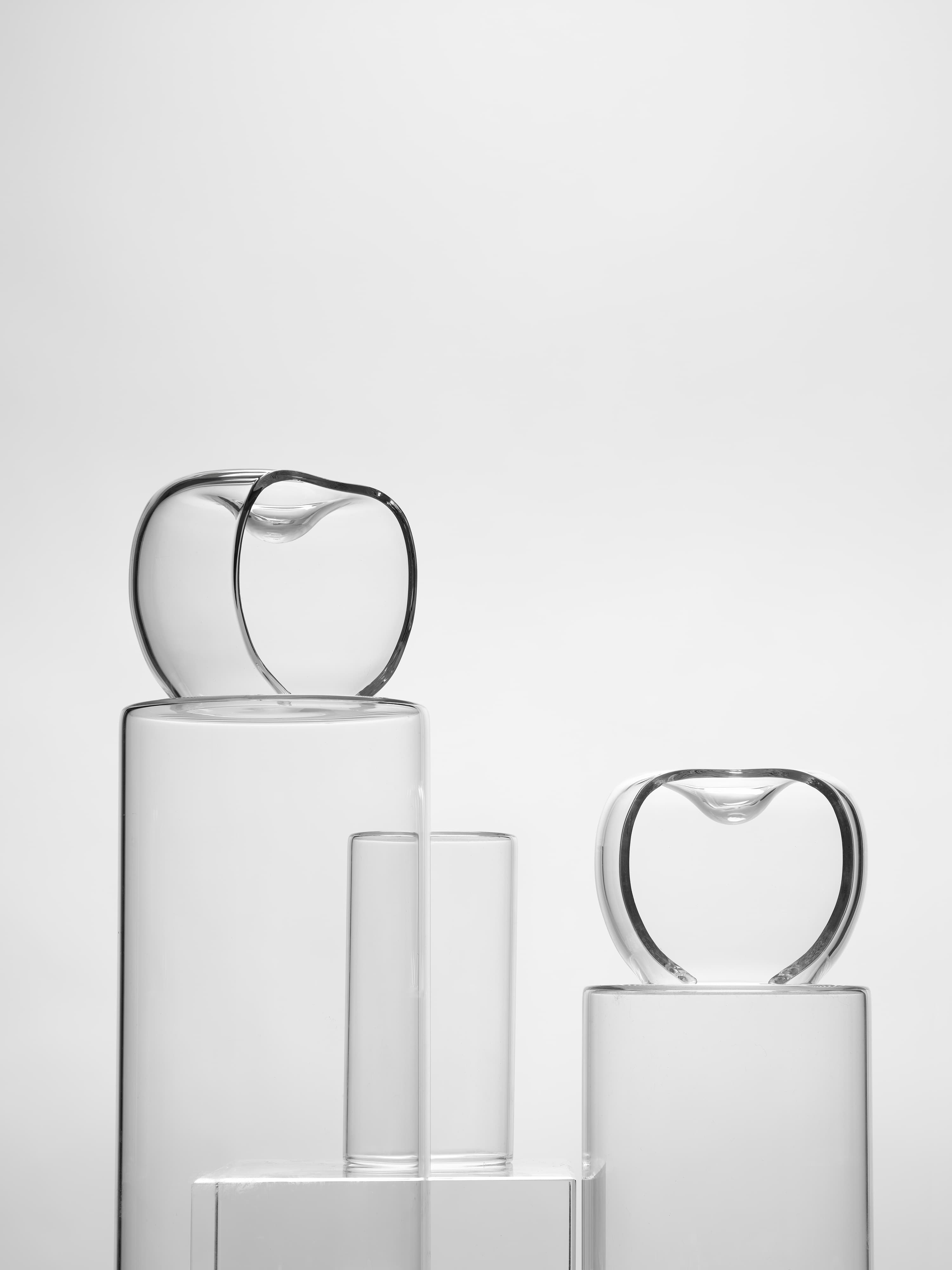

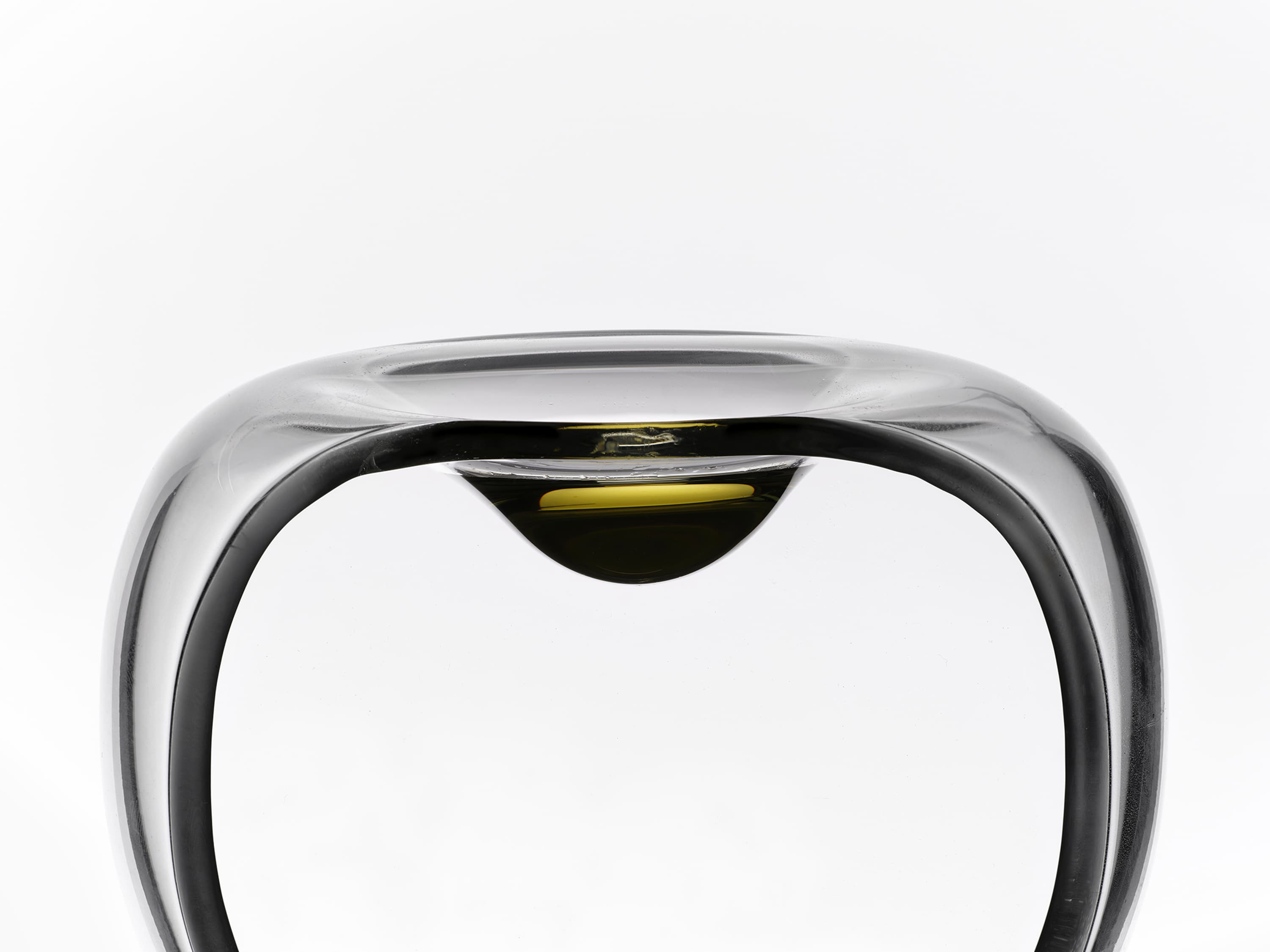
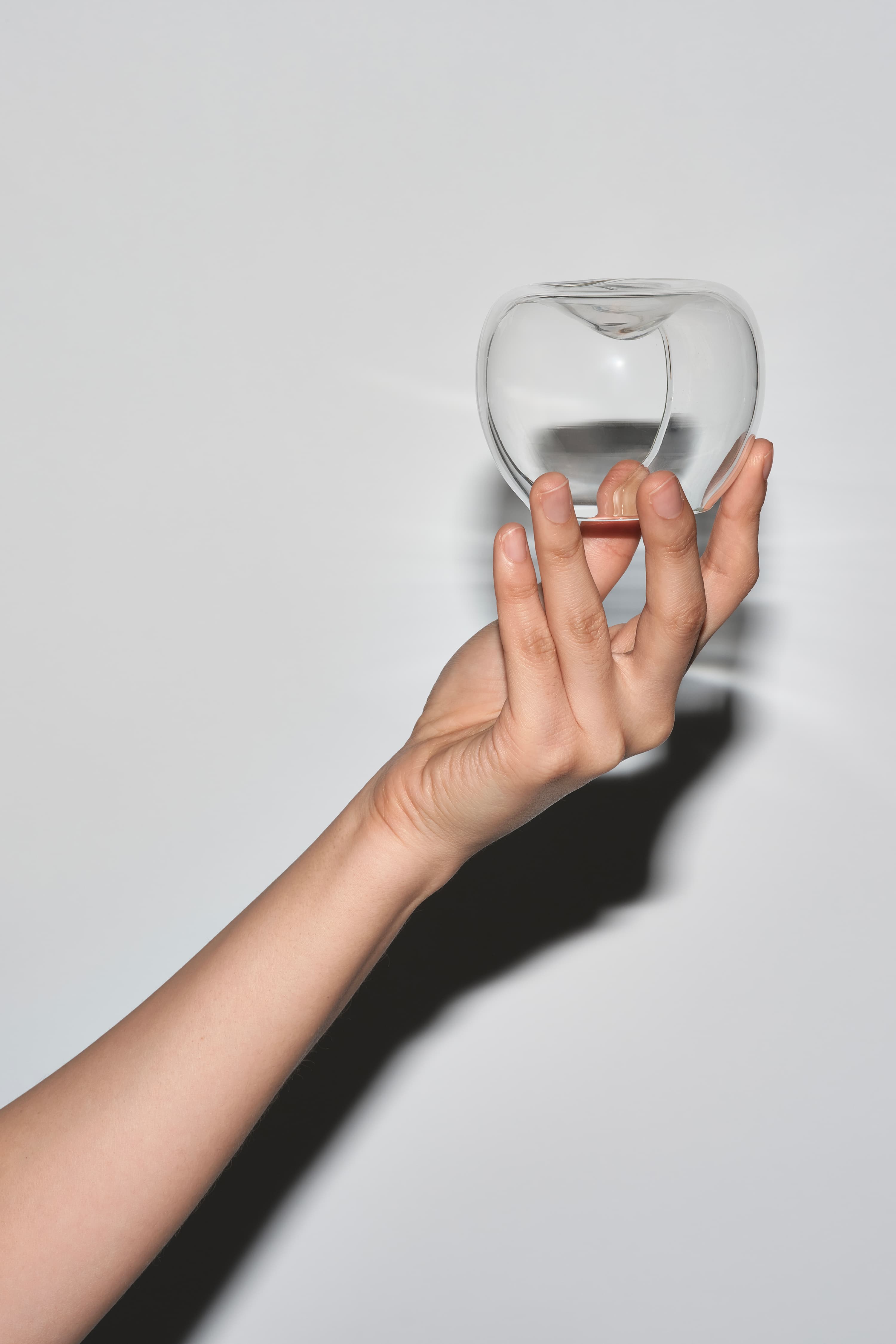
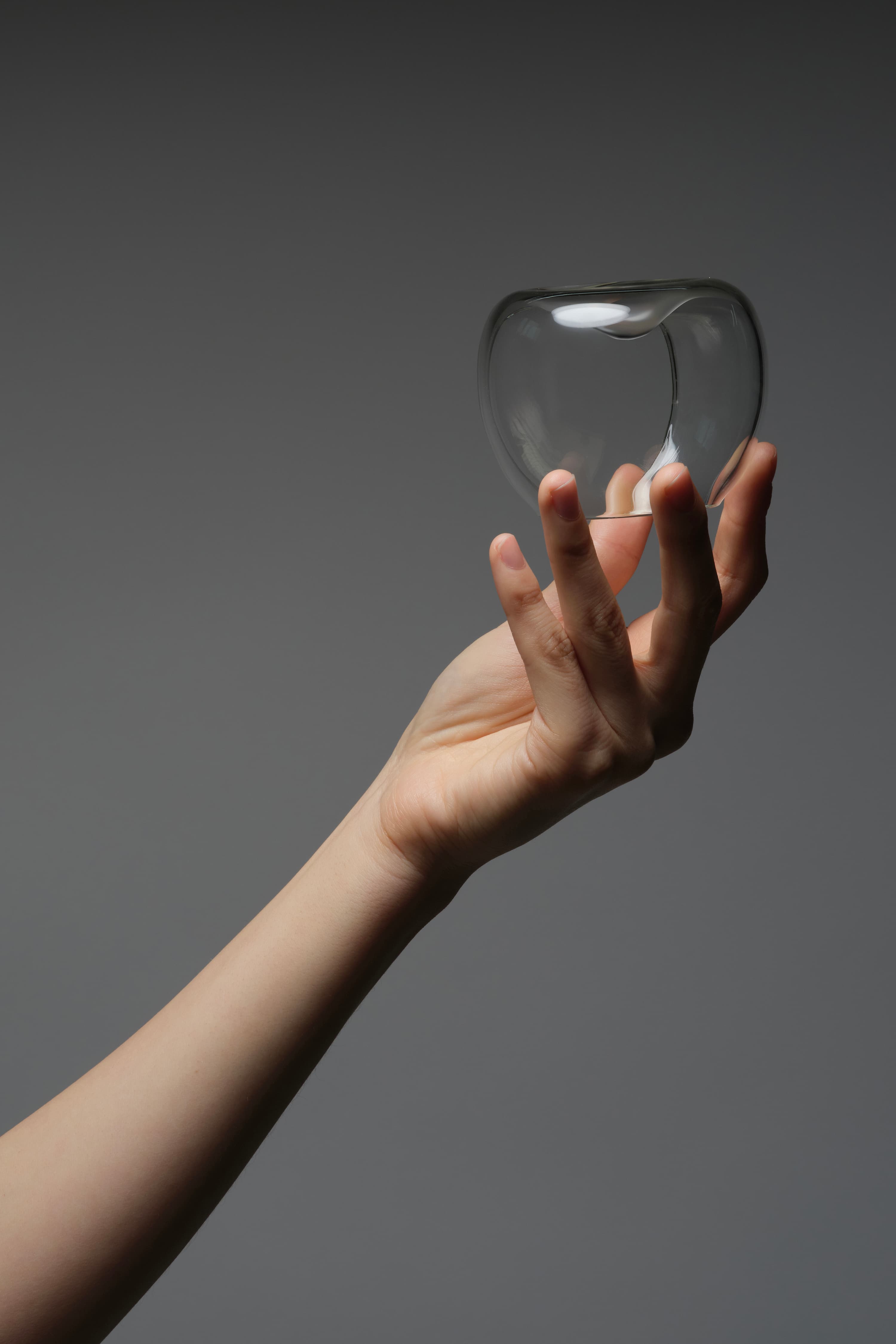
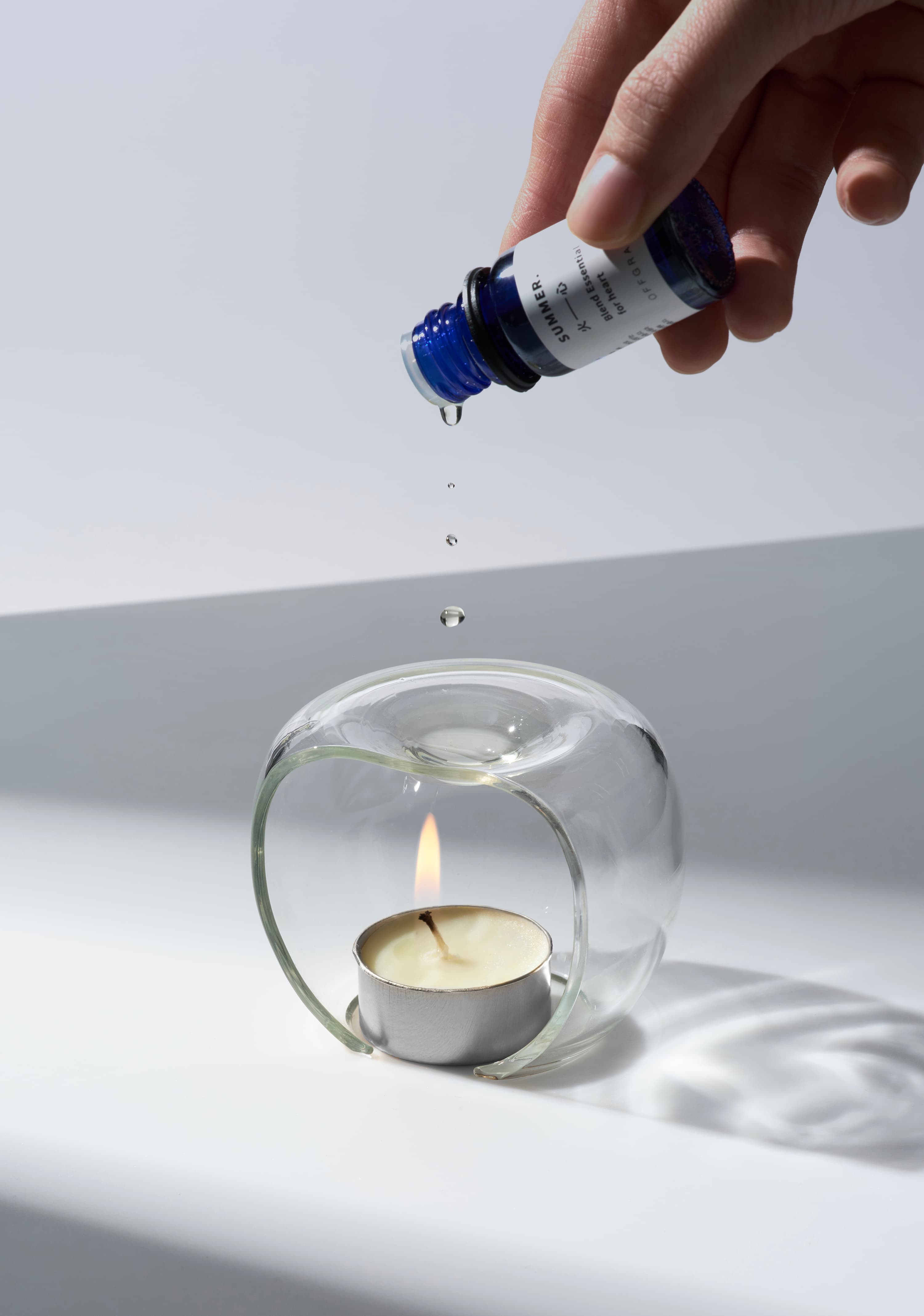
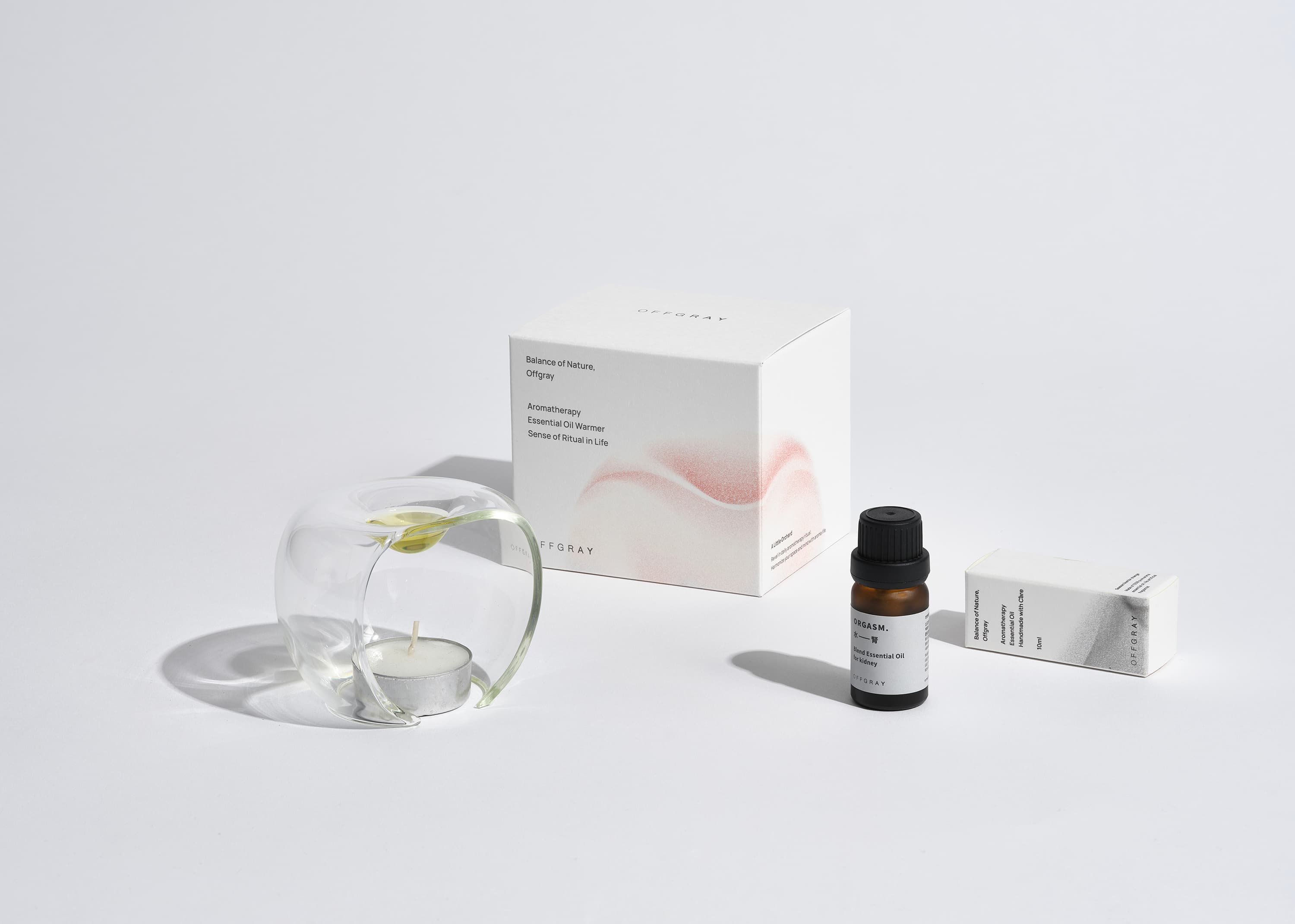
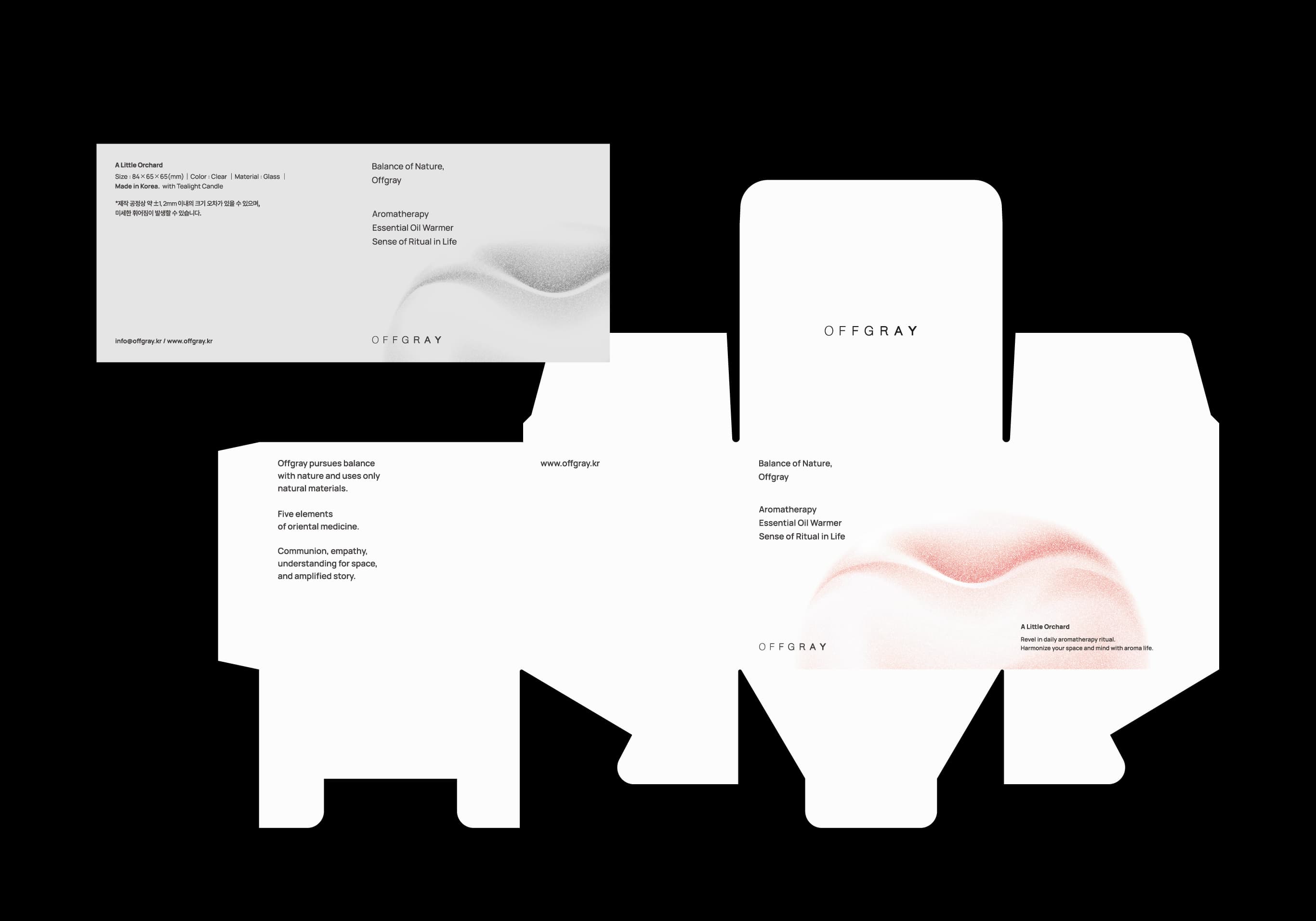
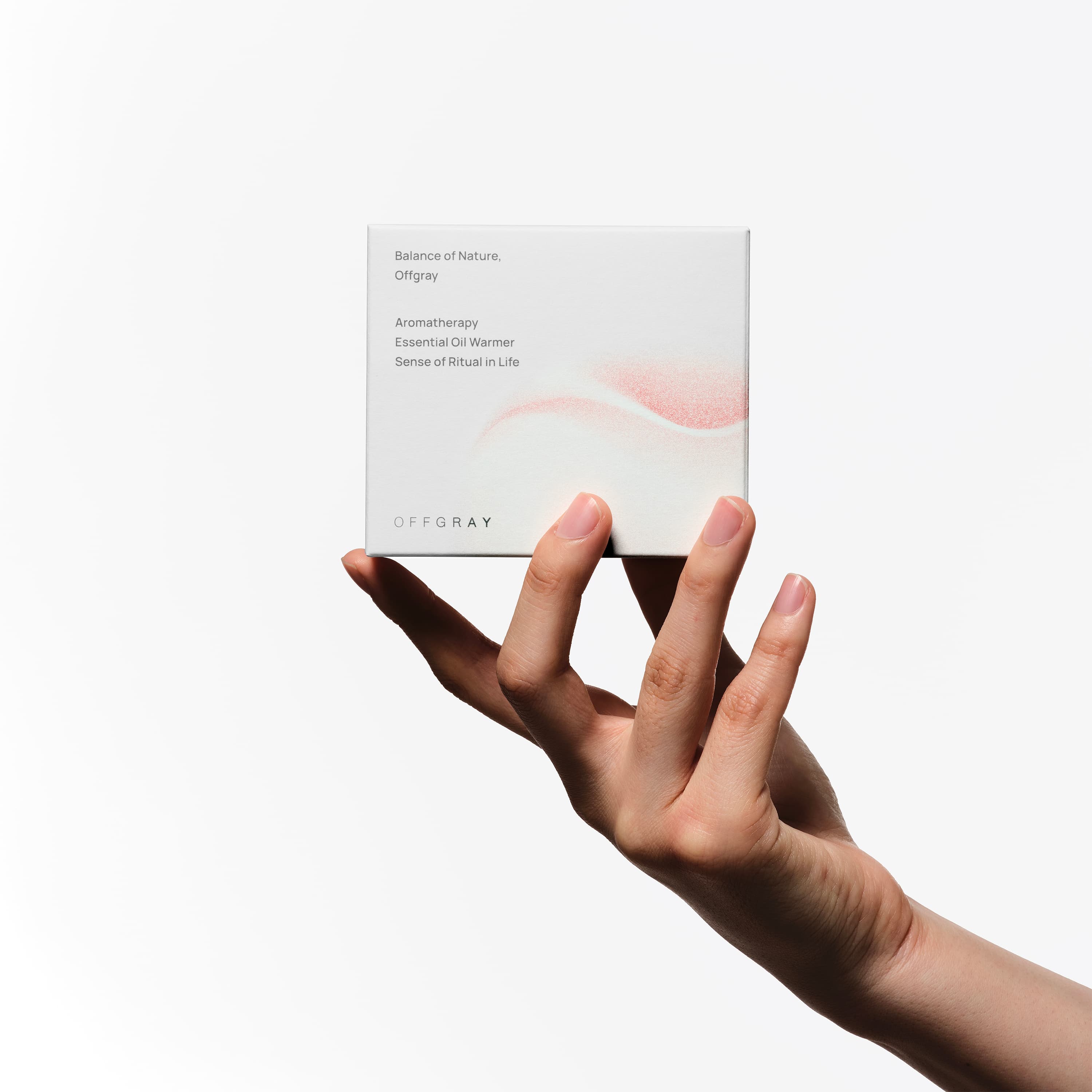
Offgray is a natural fragrance brand rooted in traditional Eastern medicine, proposing a healthy lifestyle through balance with nature. We reflected this brand direction in both product and packaging design, drawing from the form of a familiar natural object—an apple.
The apple, with its soft curves and stable volume, served as a fitting motif to convey the sense of comfort and balance the brand pursues. Its inward-flowing curves and outward-expanding form also resonate with the way scent diffuses through space.
The Orchard Oil Warmer integrates form and function into a single structure, functioning not only as a tool but as an object within space. The gently concave top surface recalls the apple’s natural indentation and serves as a reservoir for aromatic oils. A sliced cross-section on the side forms a cavity for a soy candle, extending the formal motif into a functional element. Made from heat-resistant glass, it ensures durability, while all edges are rounded to provide a soft and safe user experience.
The packaging graphic design reflects the apple’s organic curves and the flow of diffusing scent, visually connecting the product’s form with its sensory experience.
오프그레이는 동양의학에 근거한 천연 향기 브랜드로, 자연과의 균형을 통한 건강한 라이프스타일을 제안한다. 우리는 브랜드의 방향성을 반영하여, 친숙한 자연물인 사과의 형상을 기반으로 전개하였다.
사과는 부드러운 곡선과 안정적인 볼륨을 지닌 형태로, 브랜드가 지향하는 편안함과 균형감을 전달하기에 적합한 모티브였다. 또한 중심을 향해 모이는 곡선과 외곽으로 확산되는 흐름은 향이 공간에 퍼지는 방식과 맞닿아 있다.
오차드 오일 워머는 형태와 기능을 하나의 구조로 결합한 제품으로, 단순한 도구를 넘어 공간에 놓이는 오브제로 기능한다. 상단의 부드러운 곡면은 사과의 움푹 들어간 형상을 연상시키며 아로마 오일을 담는 공간을 이룬다. 측면의 사과를 자른 듯한 단면은 소이 캔들을 위한 구조로 이어진다. 내열 유리를 사용해 안정성을 확보하였으며, 모든 가장자리는 라운딩 처리해 부드럽고 안전한 사용감을 제공한다.
패키지 그래픽 디자인에는 사과의 유기적인 곡선과 향이 퍼지는 흐름을 반영해, 제품의 조형성과 감각적 경험이 시각적으로 연결되도록 구성하였다.
HERE
holistic project|branding, product|dual agent fire extinguisher|I am here
holistic project|branding, product|dual agent fire extinguisher|I am here

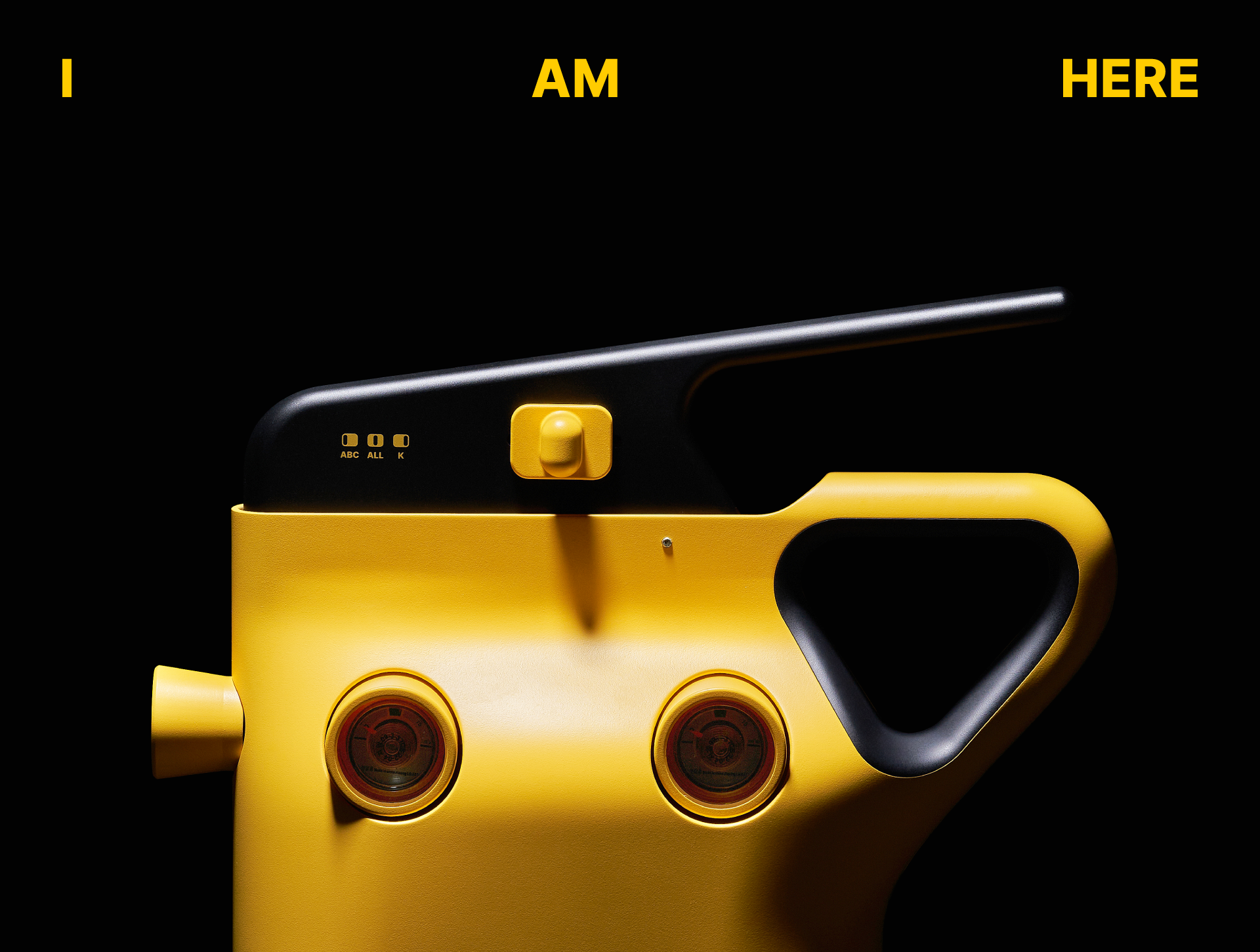

‘HERE’ is an R&D project aimed at developing a new type of fire extinguisher that can be easily used by anyone in emergency situations.
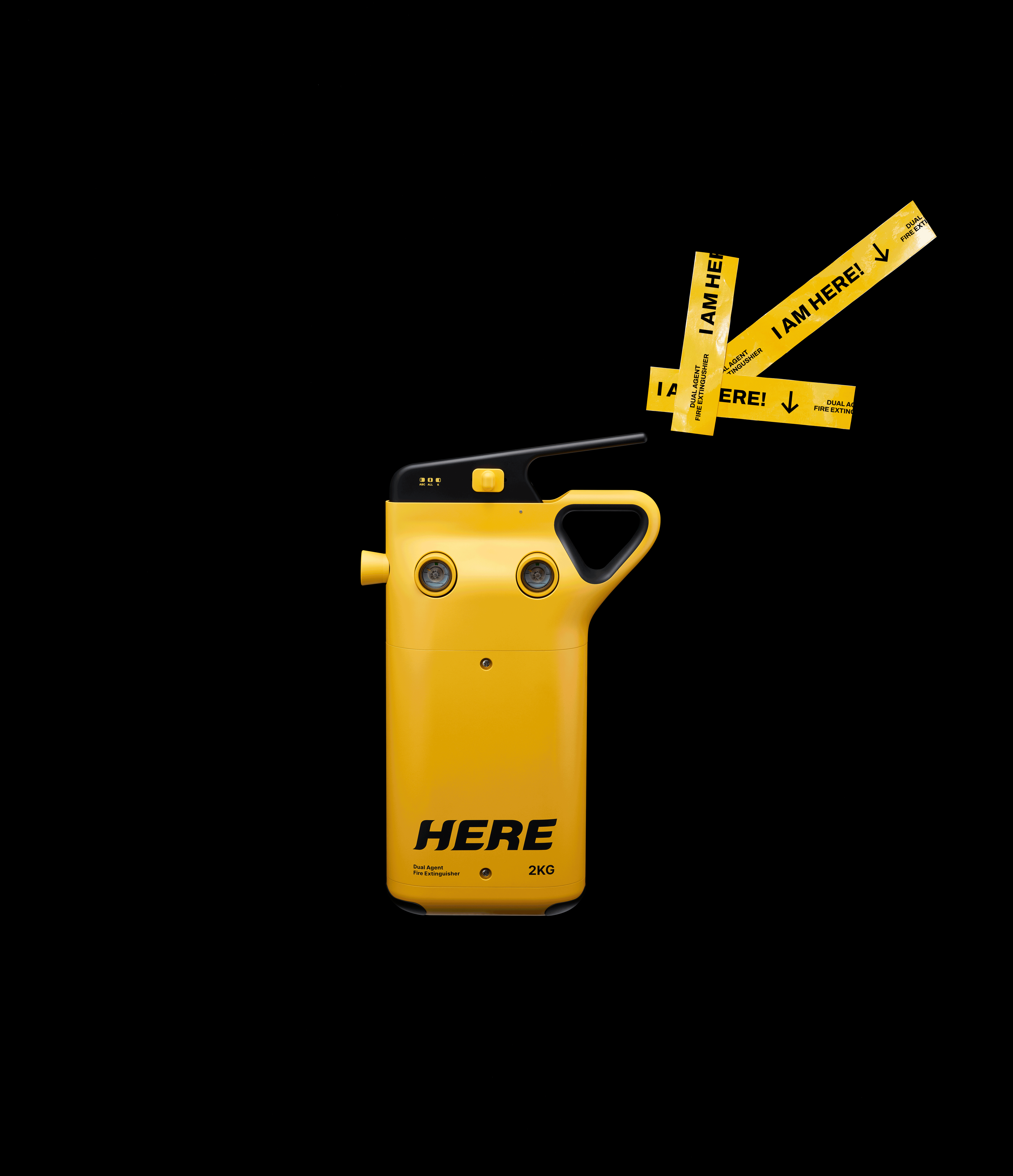
To reduce the complexity of selecting extinguishing agents and enable rapid response, ABC and K-class agents were integrated into a single product.
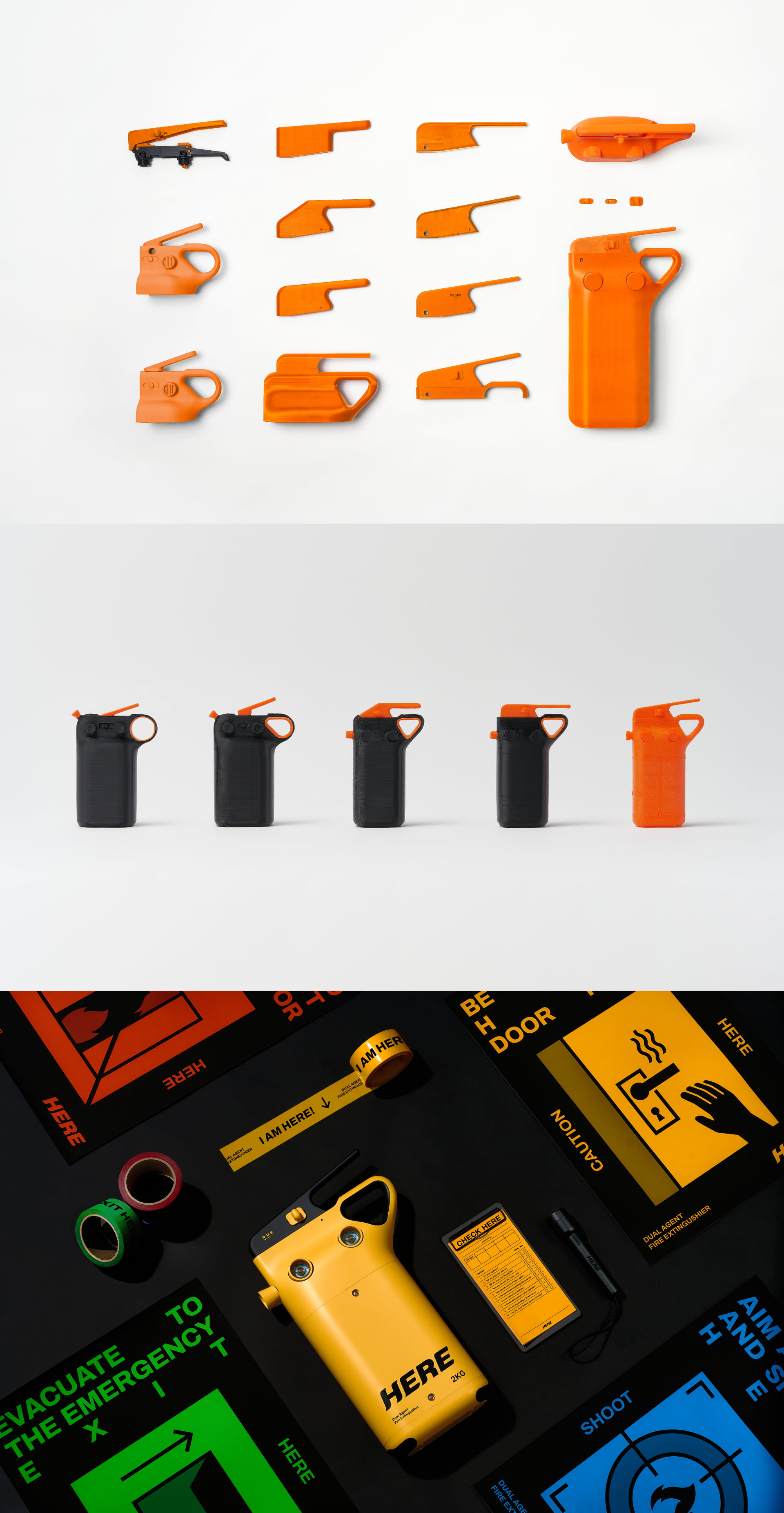
Through low-light testing and real-use scenarios we developed a form that can be recognized instantly and operated without hesitation. An intuitive switch and handle minimize decision-making in urgent situations.
A highly visible yellow color was applied to ensure quick recognition in dark environments Inspired by color systems used to distinguish fire extinguishing agents, the design balances visibility with functional meaning.
Beyond functionality, the product is designed as a signal of presence in emergencies. The name ‘HERE’ and its extended message, “I AM HERE.”,
provide a clear and immediate answer—allowing users to locate the extinguisher without hesitation. The bold logo and signage-inspired graphic language enable instant recognition leading to intuitive interaction that supports rapid judgment and action.
To reduce the complexity of selecting extinguishing agents and enable rapid response, ABC and K-class agents were integrated into a single product.
Through low-light testing and real-use scenarios we developed a form that can be recognized instantly and operated without hesitation. An intuitive switch and handle minimize decision-making in urgent situations.
A highly visible yellow color was applied to ensure quick recognition in dark environments Inspired by color systems used to distinguish fire extinguishing agents, the design balances visibility with functional meaning.
Beyond functionality, the product is designed as a signal of presence in emergencies. The name ‘HERE’ and its extended message, “I AM HERE.”,
provide a clear and immediate answer—allowing users to locate the extinguisher without hesitation. The bold logo and signage-inspired graphic language enable instant recognition leading to intuitive interaction that supports rapid judgment and action.
‘HERE’는 위기 상황에서 누구나 쉽게 사용할 수 있는 신개념 소화기 개발을 목표로 한 R&D 프로젝트이다. 화재 시 약제 선택의 복잡함을 줄이고, 빠르고 정확한 대응을 위해 ABC급과 K급 이중 소화약제를 하나의 제품에 통합하였다.
우리는 실제 저조도 환경과 다양한 사용 시나리오 테스트를 통해 가장 빠르게 인지되고 즉각적으로 작동할 수 있는 형태를 도출하였다. 직관적인 스위치와 손잡이 구조는 긴박한 상황 속에서도 사용자의 판단을 최소화한다.
컬러는 어두운 환경에서도 빠른 인지를 유도하기 위해 시인성이 높은 옐로우를 적용하였다. 화재 대응 소화약제 구분에 사용되는 컬러 체계에서 착안해 기능성과 가시성을 동시에 확보하였다.
또한 이 제품은 단순한 기능을 넘어, 위기 상황에서 ‘존재를 알리는 신호’가 되도록 브랜딩을 설계하였다. ‘HERE’라는 네이밍과 확장된 메시지 “I AM HERE.”는 사용자가 소화기의 위치를 망설임 없이 인지하도록, 존재 자체로 명확한 신호를 전달한다. 볼드한 로고와 표지판에서 차용한 그래픽 언어는 복잡한 해석 없이도 즉각적인 인지를 유도하며, 빠른 판단과 행동으로 이어지는 직관적인 사용 경험을 완성한다.