TIIUM
branding|for a new city in Cambodia|tiium
branding|for a new city in Cambodia|tiium
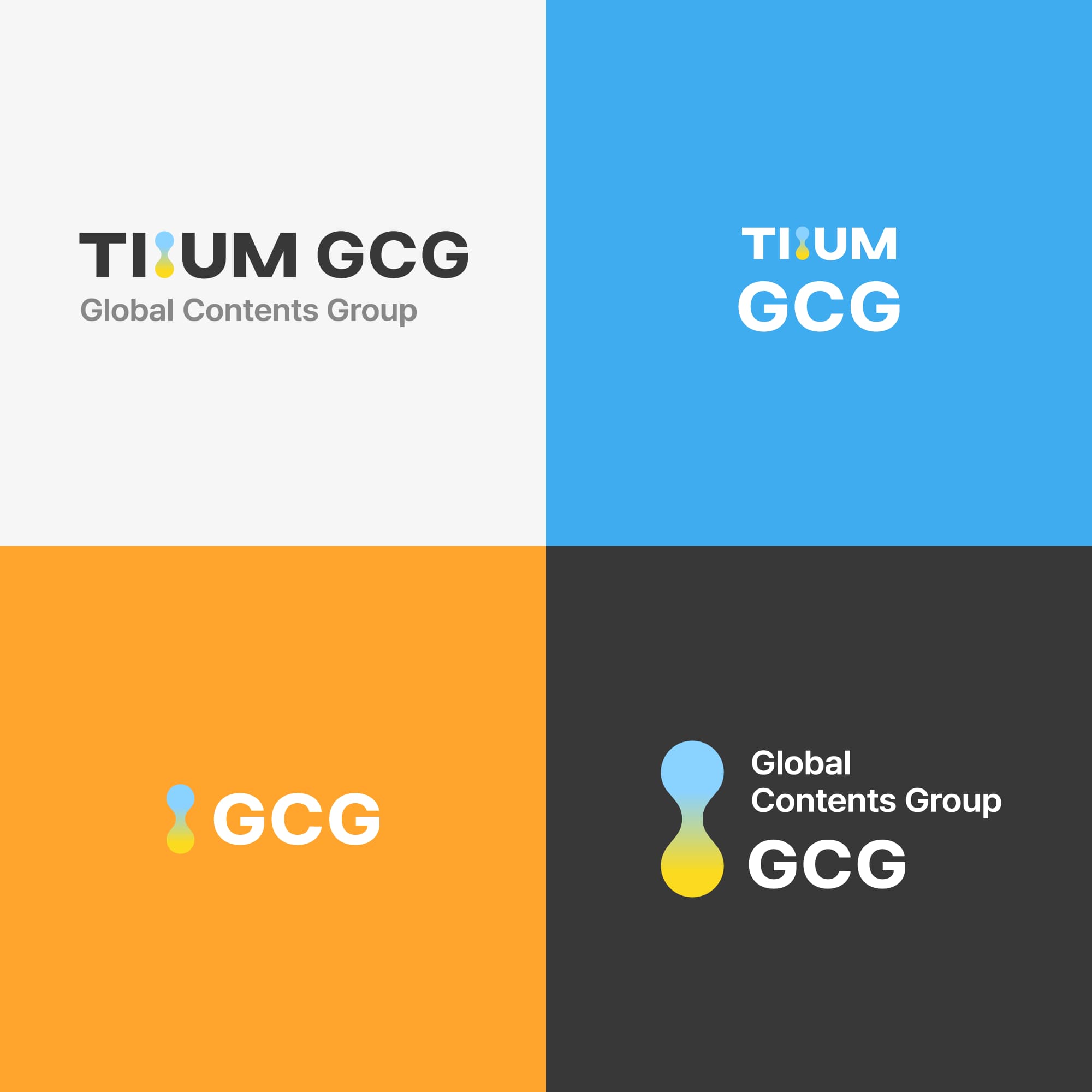
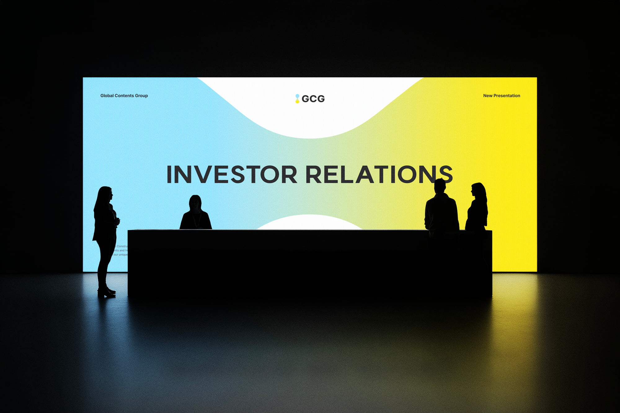
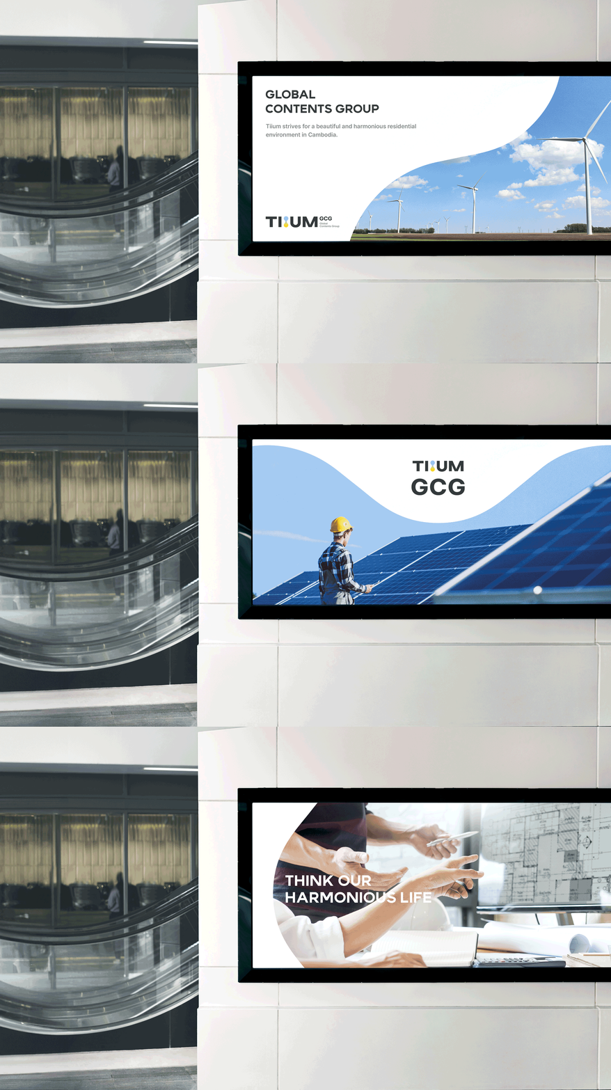
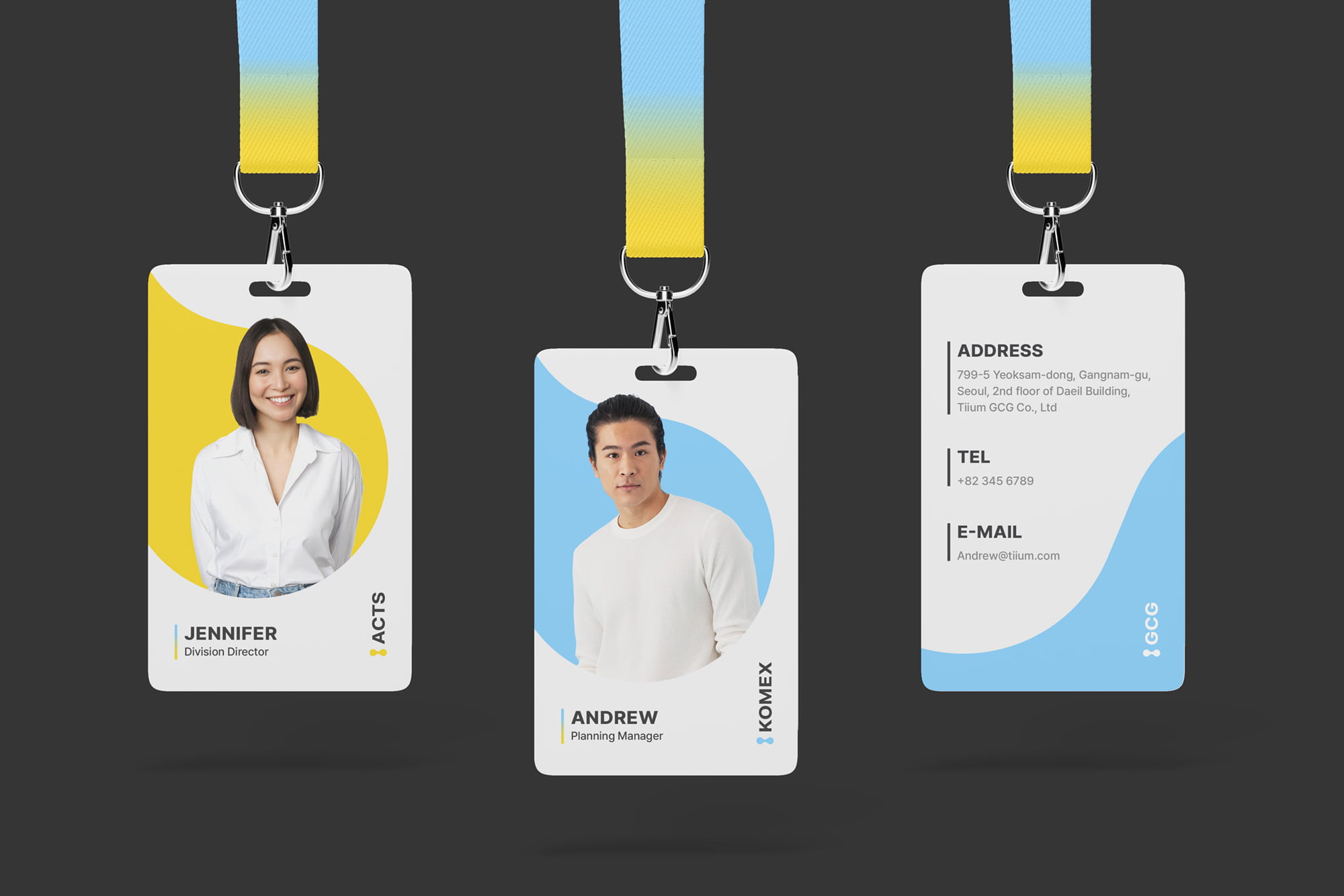
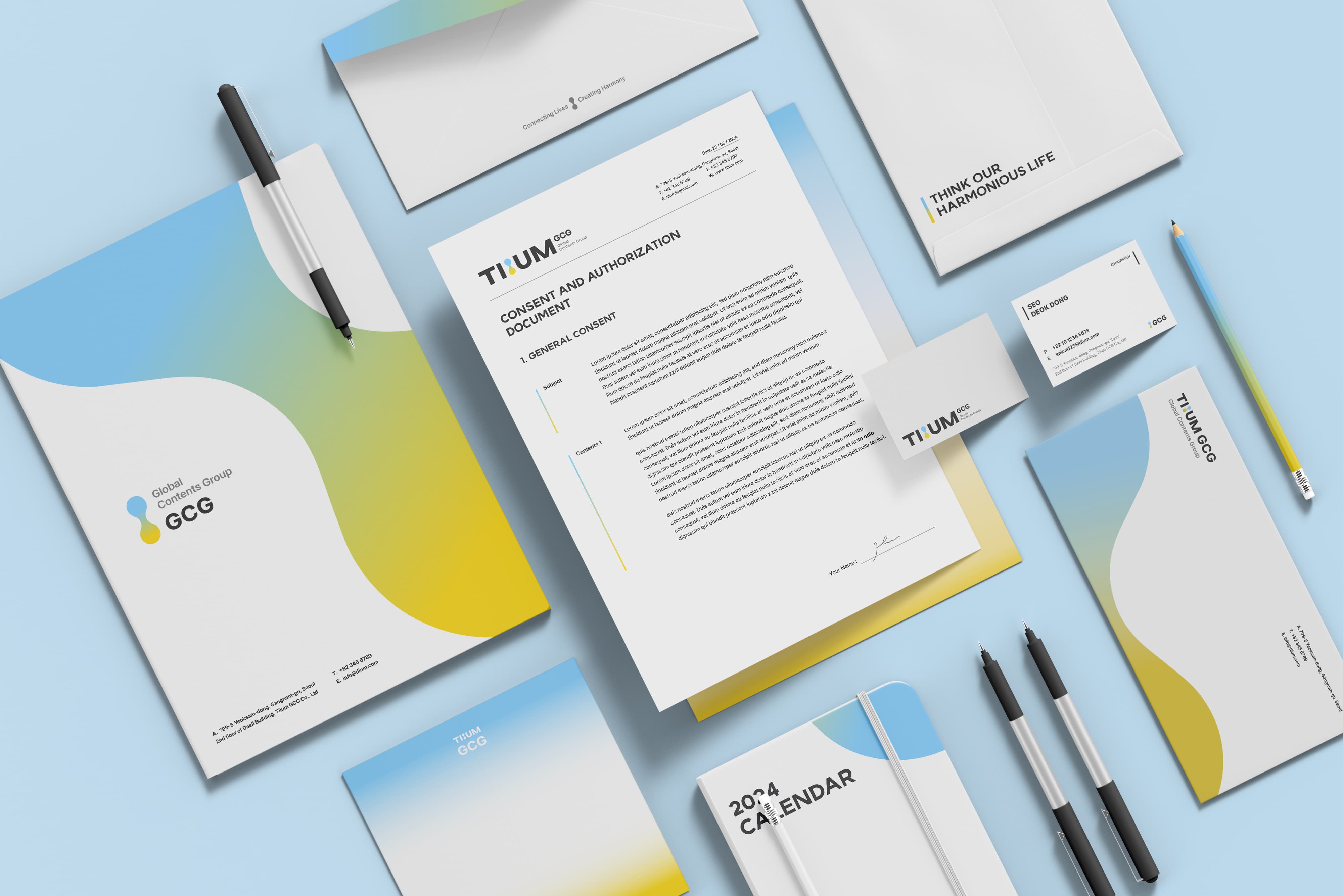
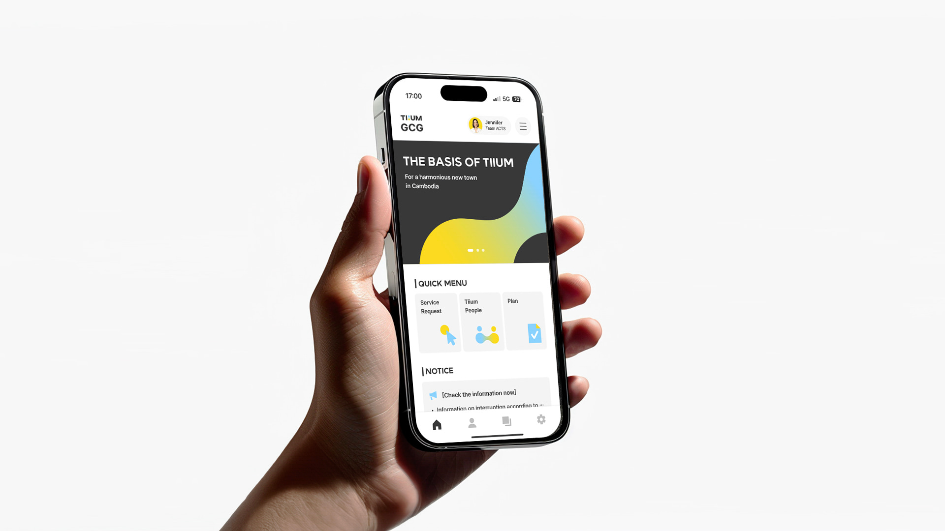
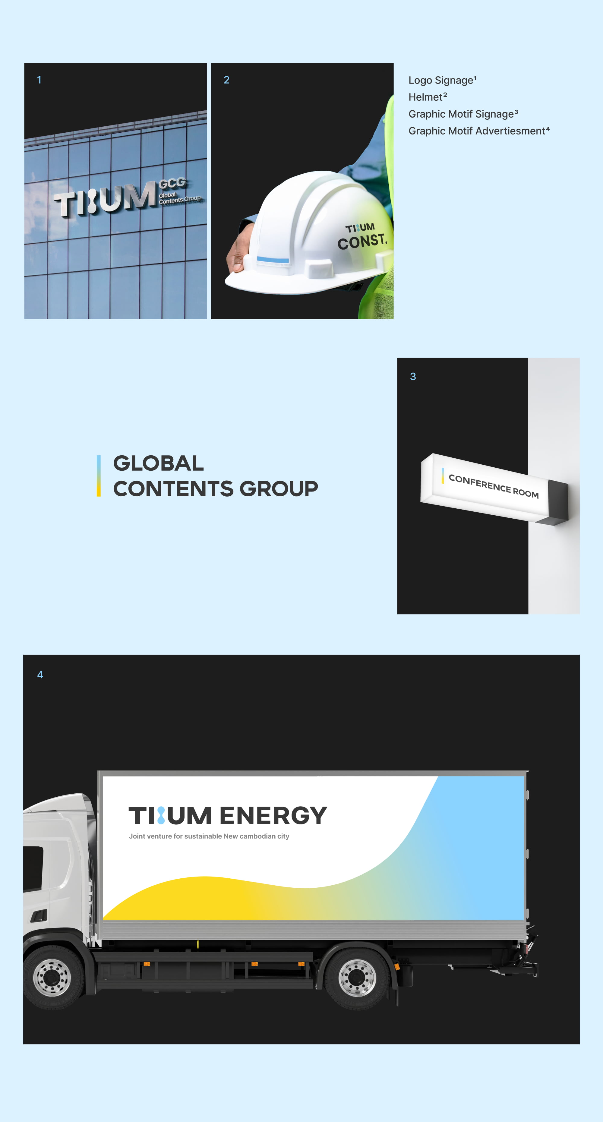
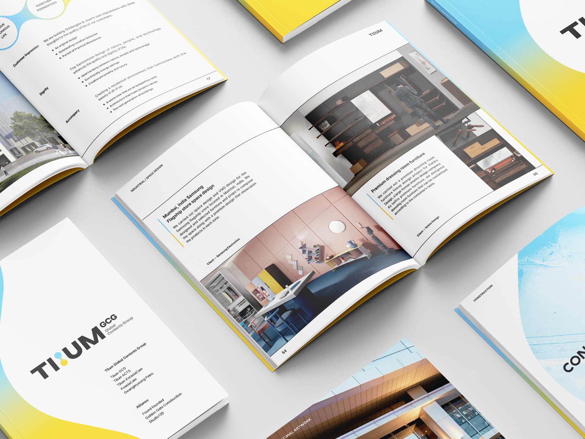
Tiium is a name inspired by the Korean word ttium, which conveys the ideas of sprouting and opening new possibilities. It is a multidisciplinary joint venture established by companies in architecture, construction, industrial design, and energy, with the goal of planning, designing, and developing a sustainable and harmonious urban environment in Cambodia. We developed a brand identity that reflects Tiium’s vision and philosophy.
Tiium’s core values lie in improving quality of life and creating a sustainable city through collaboration across diverse fields. Based on these values, we developed an organically connected logo symbol that visualizes different areas of expertise coming together to create new value.
The two primary colors symbolize a collaborative process in which different people and disciplines think, create, and work in harmony. Applied consistently throughout the brand identity, the flexible visual language communicates Tiium’s values of connection and growth while expressing its vision for a city shaped through collective effort.
Tiium’s core values lie in improving quality of life and creating a sustainable city through collaboration across diverse fields. Based on these values, we developed an organically connected logo symbol that visualizes different areas of expertise coming together to create new value.
The two primary colors symbolize a collaborative process in which different people and disciplines think, create, and work in harmony. Applied consistently throughout the brand identity, the flexible visual language communicates Tiium’s values of connection and growth while expressing its vision for a city shaped through collective effort.
‘싹’, ‘막힌 것을 틔우다’라는 의미를 담은 Tiium은 건축, 건설, 산업디자인, 에너지 등 다양한 분야의 기업이 함께 설립한 합작 법인으로, 캄보디아 신도시의 지속 가능하고 조화로운 도시 환경을 계획·설계·개발하는 것을 목표로 한다. 우리는 Tiium의 비전과 철학을 담아 브랜드 아이덴티티를 구축하였다.
Tiium의 핵심 가치는 사람들의 삶의 질을 높이고, 다양한 분야의 협업을 통해 지속 가능한 도시를 만들어가는 데 있다. 이러한 가치를 바탕으로 서로 유기적으로 연결되는 형태의 로고 심볼을 개발하여, 각기 다른 전문성이 하나로 모여 새로운 가치를 만들어가는 Tiium의 정체성을 시각화하였다.
또한 두 가지 메인 컬러는 서로 다른 분야와 사람들이 함께 사고하고 창조하며 조화를 이루는 협업의 과정을 상징한다. 브랜드 전반에 적용된 유연한 시각 언어는 Tiium이 추구하는 연결과 성장의 가치를 일관되게 전달하며, 함께 만들어가는 도시의 비전을 표현한다.
Tiium의 핵심 가치는 사람들의 삶의 질을 높이고, 다양한 분야의 협업을 통해 지속 가능한 도시를 만들어가는 데 있다. 이러한 가치를 바탕으로 서로 유기적으로 연결되는 형태의 로고 심볼을 개발하여, 각기 다른 전문성이 하나로 모여 새로운 가치를 만들어가는 Tiium의 정체성을 시각화하였다.
또한 두 가지 메인 컬러는 서로 다른 분야와 사람들이 함께 사고하고 창조하며 조화를 이루는 협업의 과정을 상징한다. 브랜드 전반에 적용된 유연한 시각 언어는 Tiium이 추구하는 연결과 성장의 가치를 일관되게 전달하며, 함께 만들어가는 도시의 비전을 표현한다.