TI:UM
brand identity|graphic|for a new city in Cambodia
brand identity|graphic|for a new city in Cambodia

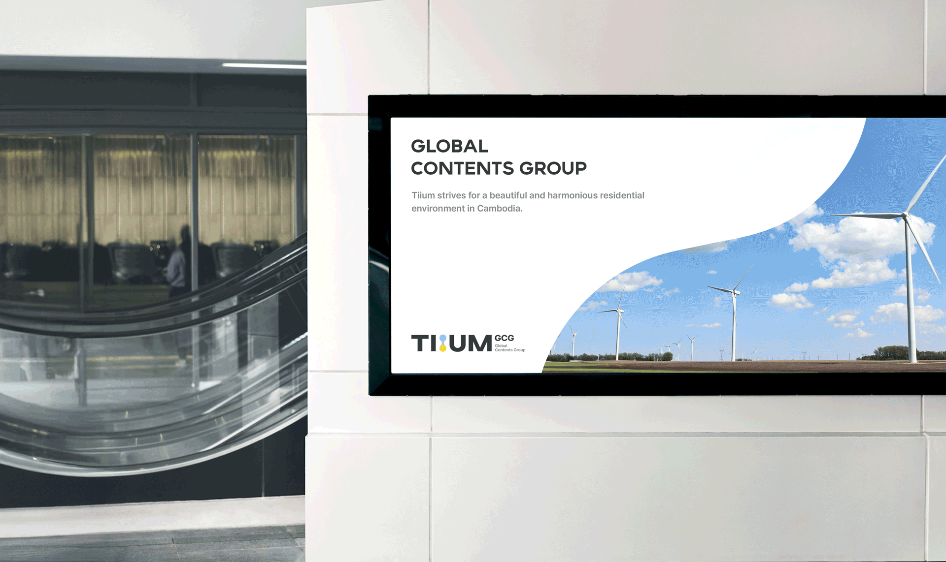


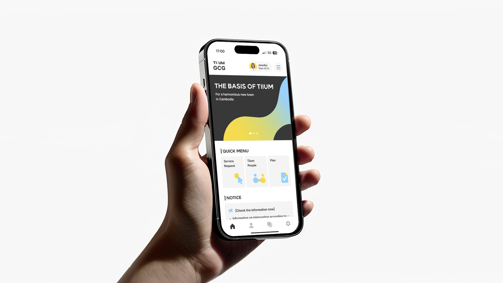

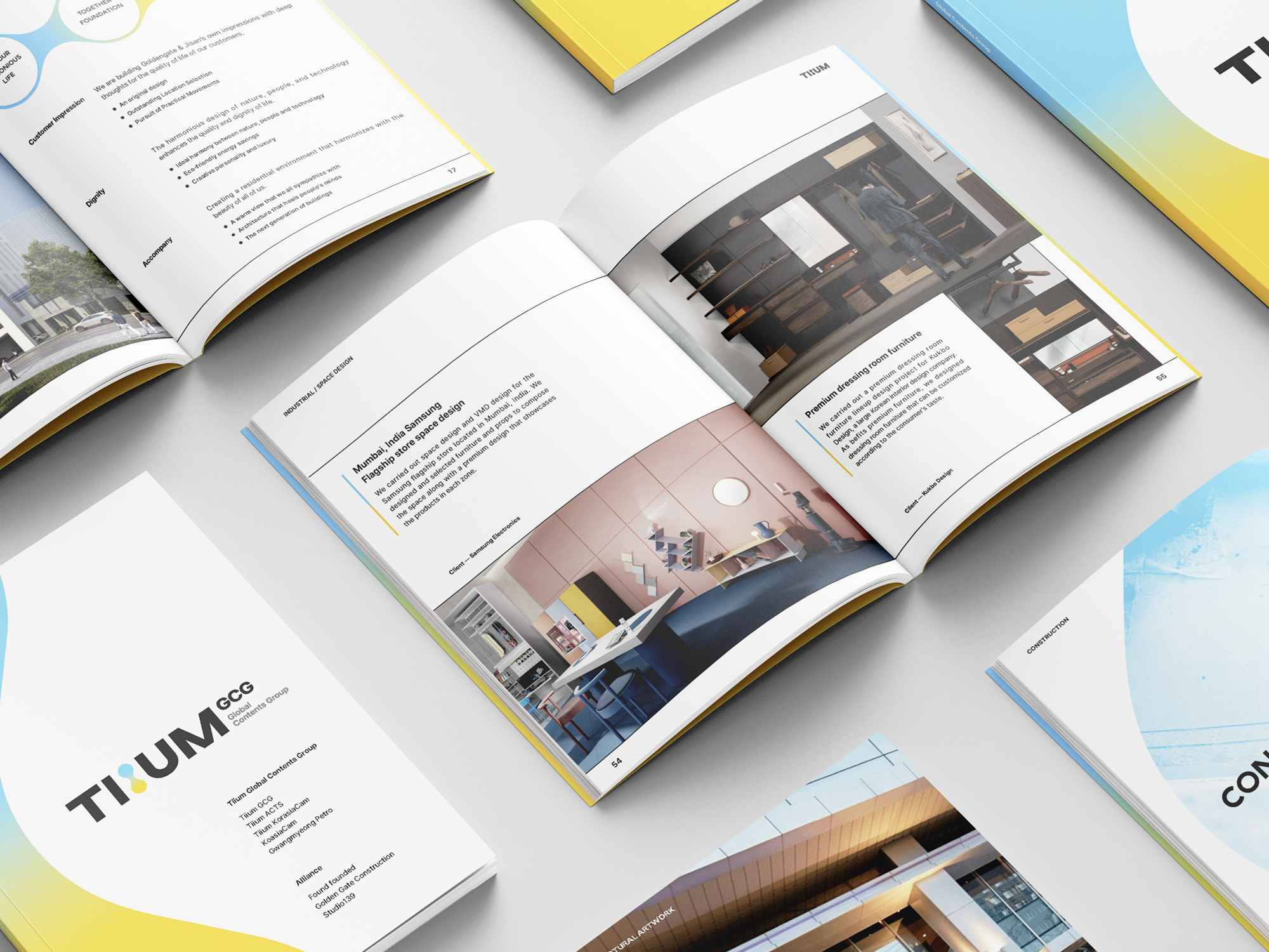
Tiium, meaning 'sprout' or 'opening up what is blocked,' is a joint corporation where companies from various fields, such as architecture, construction, industrial design, and energy, come together to plan, design, and develop a beautiful and harmonious environment in a new city in Cambodia. We conducted the design of tiium's brand identity.
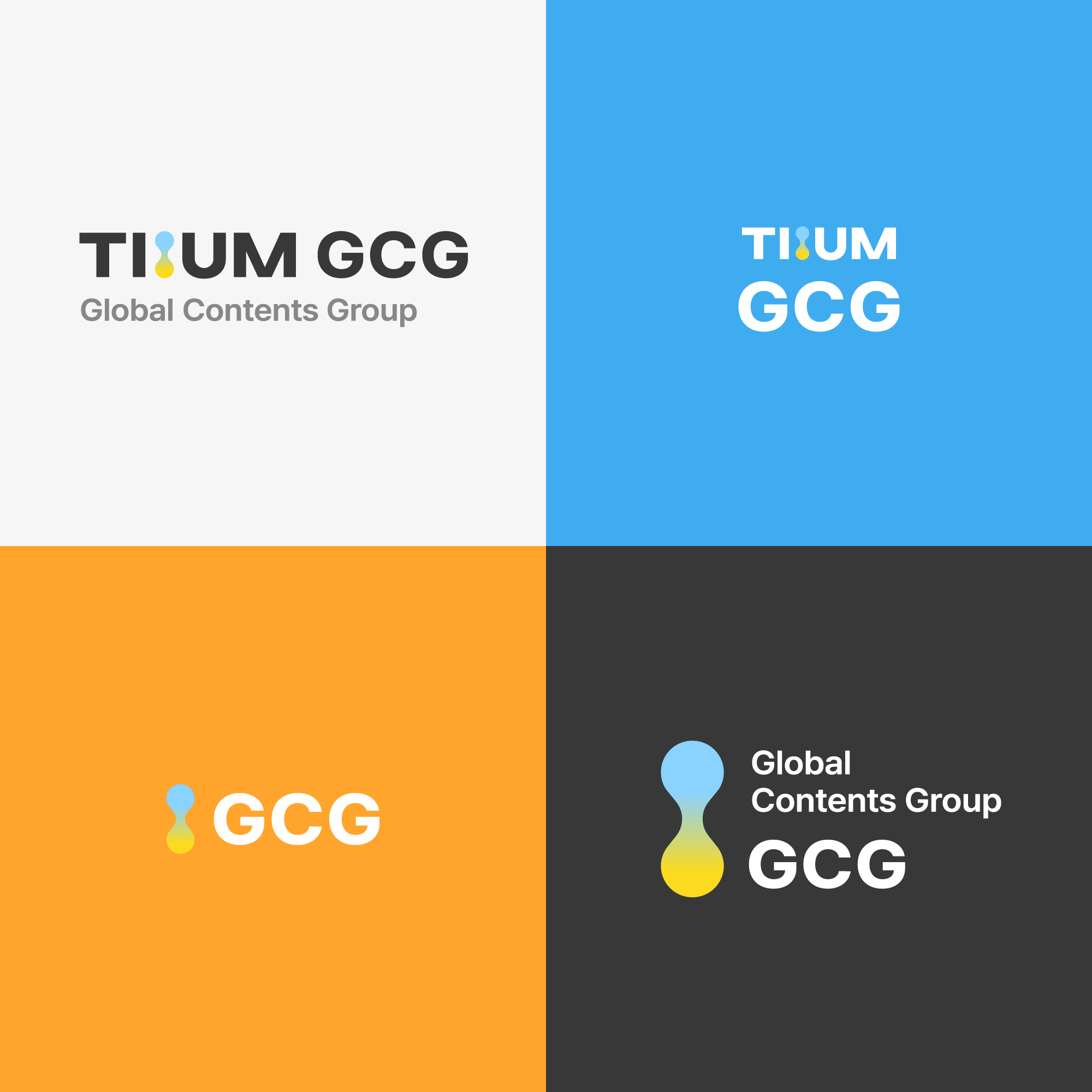
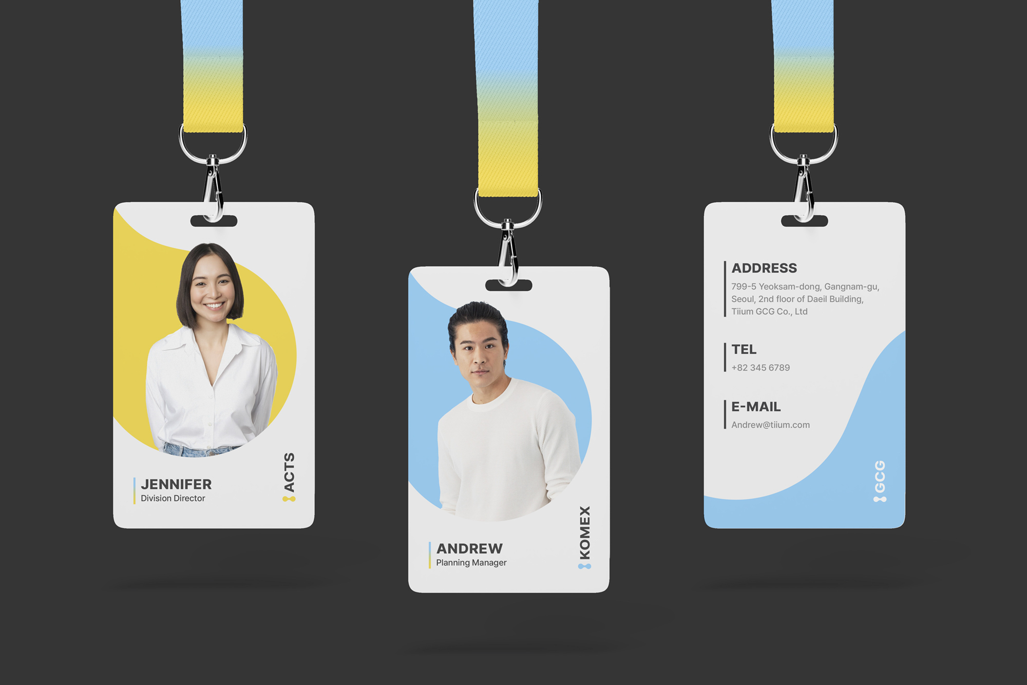
Tiium's core values are to enhance people's quality of life, create a beautiful and balanced environment, and promote communication and collaboration. The organically connected shapes of logo symbol represent Tiium's vision of achieving progress through communication. The harmony of the two main colors symbolizes a community that thinks, creates, and merges together.
Tiium's core values are to enhance people's quality of life, create a beautiful and balanced environment, and promote communication and collaboration. The organically connected shapes of logo symbol represent Tiium's vision of achieving progress through communication. The harmony of the two main colors symbolizes a community that thinks, creates, and merges together.
'싹', '막힌 것을 틔우다'라는 뜻의 tiium은 건축, 건설, 산업 디자인, 에너지 등 다양한 분야의 기업들이 모여 캄보디아 신도시의 아름답고 조화로운 환경을 계획, 설계, 개발하는 합작 법인이다. 우리는 tiium의 브랜드 아이덴티티 디자인을 진행했다.
티움의 핵심 가치는 사람들의 삶의 질을 높이고, 아름답고 조화로운 환경을 조성하며 소통과 협력을 촉진하는 것이다.
유기적으로 연결된 로고 심볼의 형상을 통해, 소통으로 함께 이루어 나가는 Tiium을 형상화했다. 두 가지 메인 컬러의 조화는 함께 사고하고 창조하며 융합하는 공동체를 상징한다.
티움의 핵심 가치는 사람들의 삶의 질을 높이고, 아름답고 조화로운 환경을 조성하며 소통과 협력을 촉진하는 것이다.
유기적으로 연결된 로고 심볼의 형상을 통해, 소통으로 함께 이루어 나가는 Tiium을 형상화했다. 두 가지 메인 컬러의 조화는 함께 사고하고 창조하며 융합하는 공동체를 상징한다.