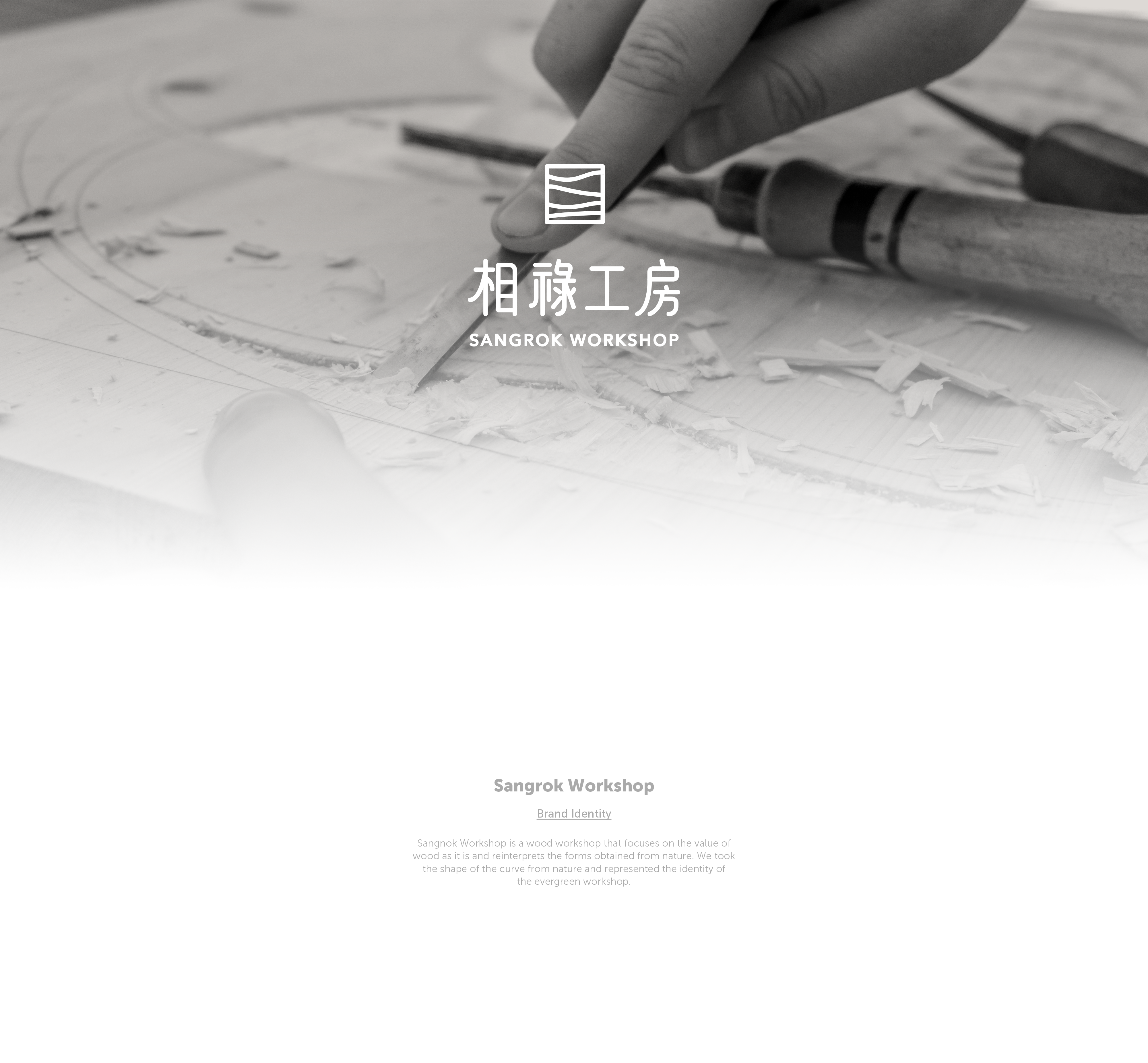
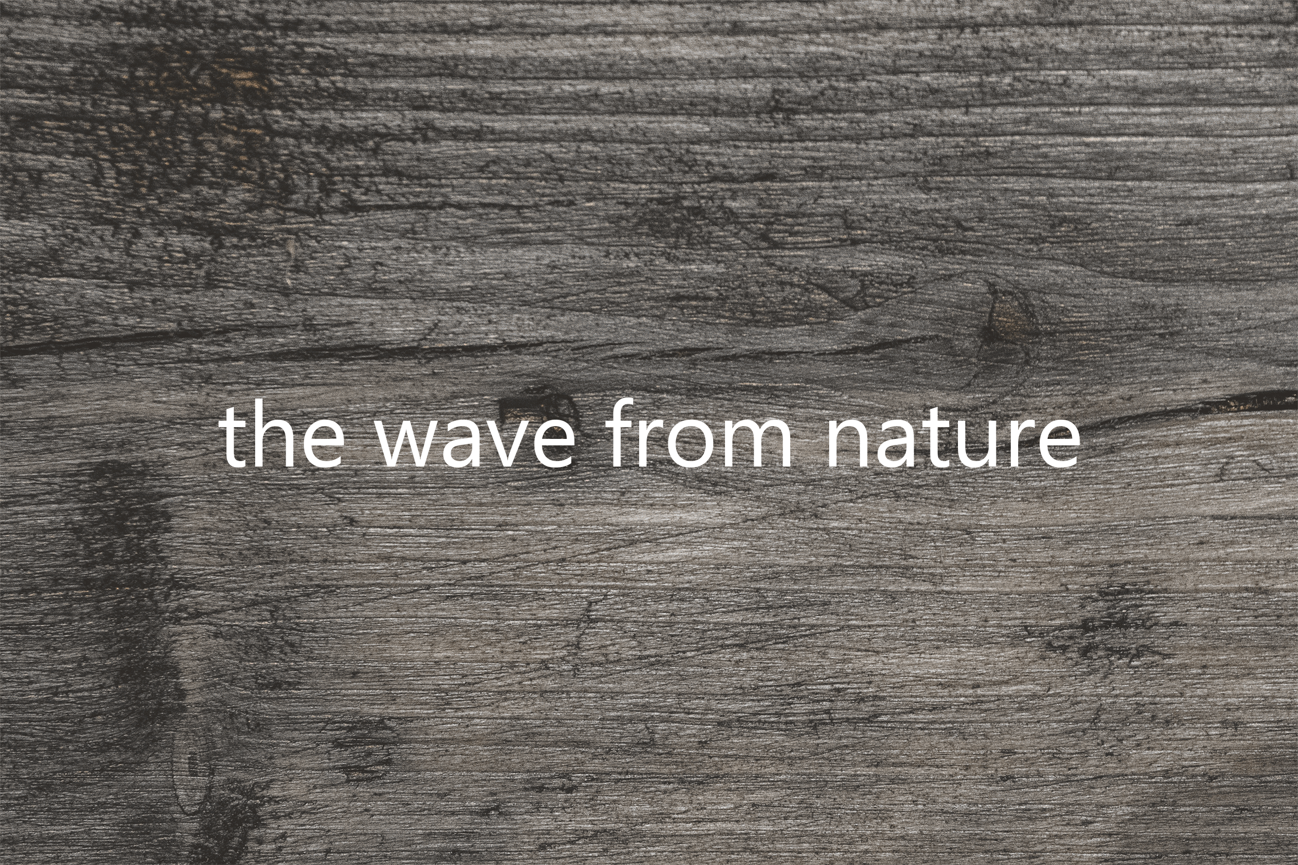
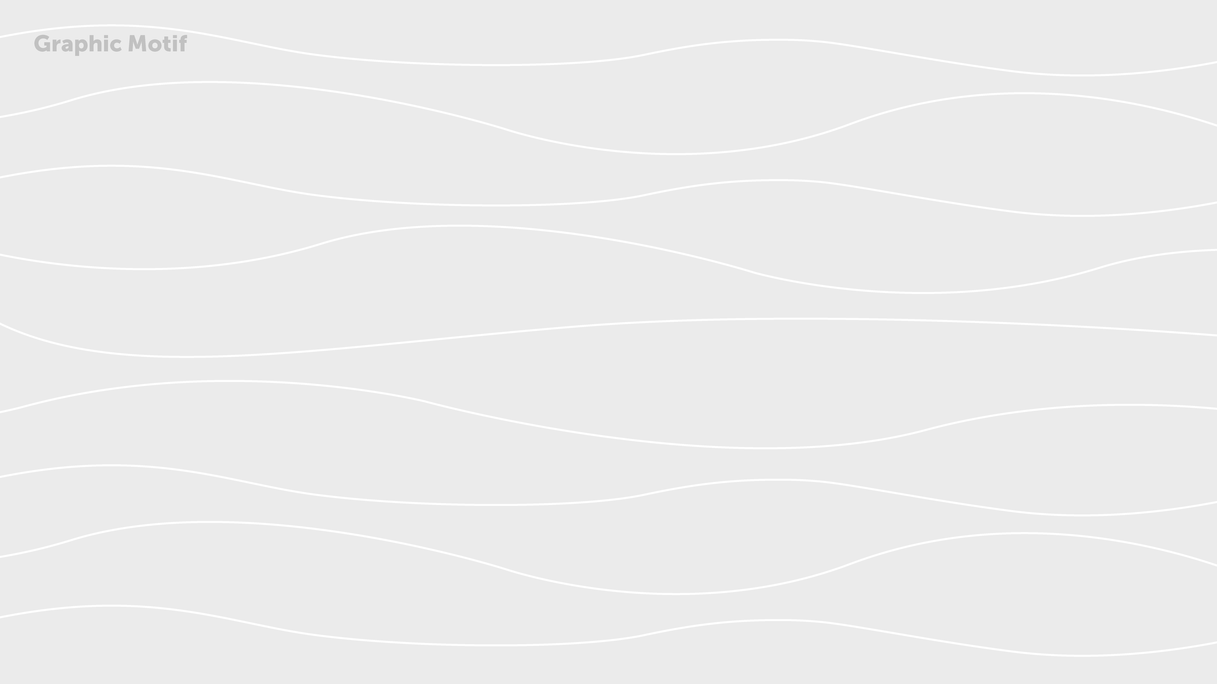
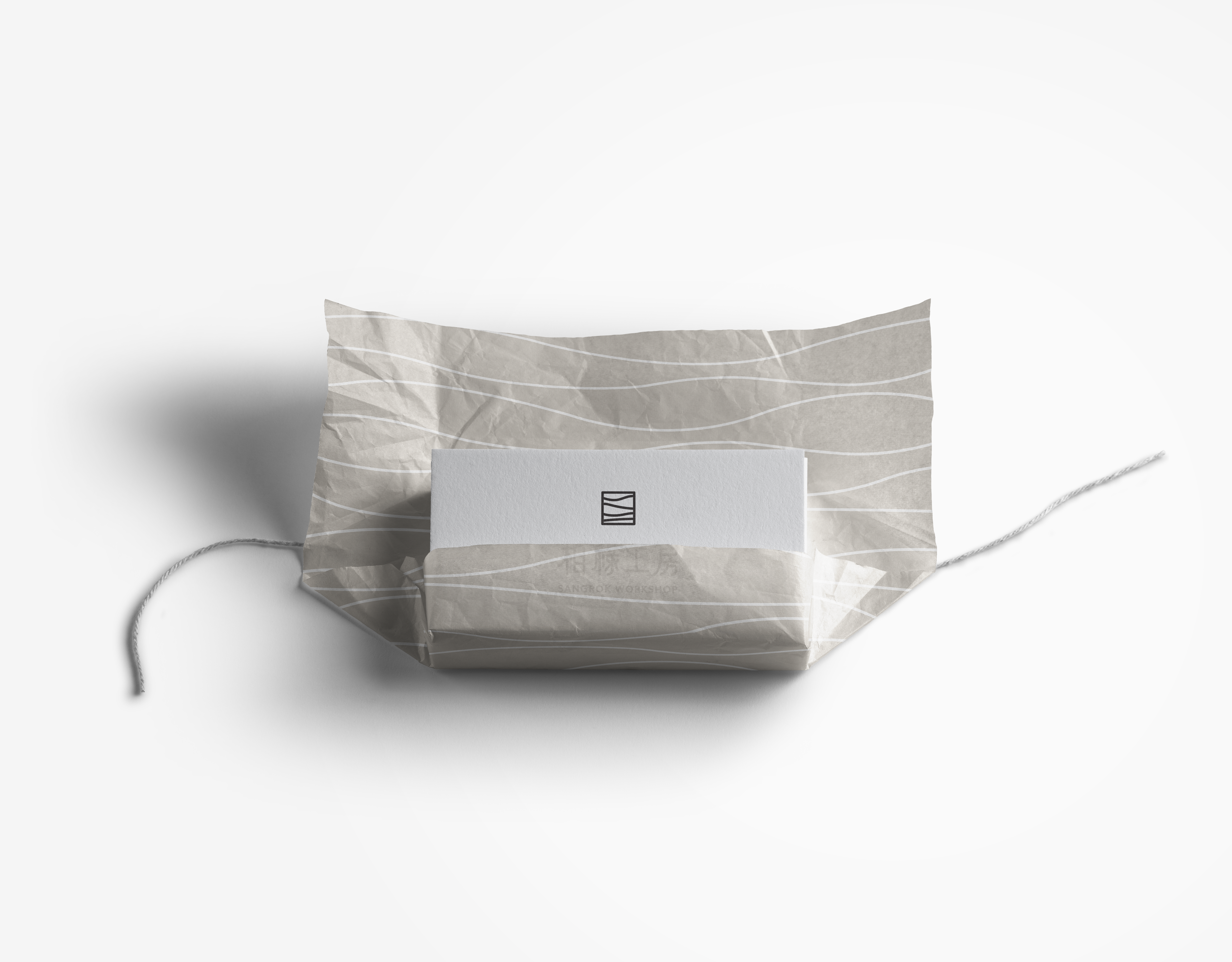
Sangrok Workshop is a woodworking studio that values the inherent qualities of wood and reinterprets the forms and textures found in nature. Based on this philosophy, we developed a consistent brand identity. The logo simplifies the flowing curves found in wood grain, symbolizing the workshop’s respect for the order of nature. In addition, the wood grain pattern has been applied across packaging and visual elements, consistently conveying the brand’s message of harmony with nature.
상록공방은 목재가 지닌 본연의 가치에 집중하며, 자연에서 얻은 형태와 결을 재해석해 작업하는 목공방이다. 우리는 이러한 철학을 바탕으로 일관된 브랜드 아이덴티티를 구축했다. 로고는 나무의 결에서 발견되는 곡선의 흐름을 단순화해 담았으며, 이는 자연의 질서를 따르는 공방의 태도를 상징한다. 또한 패키지와 시각 요소 전반에 나뭇결 패턴을 적용해, 브랜드가 지향하는 ‘자연과의 조화’라는 메시지를 일관되게 전달했다.