NUCHEAT
branding, package|wellness lifestyle brand, protein shake|natiko
branding, package|wellness lifestyle brand, protein shake|natiko
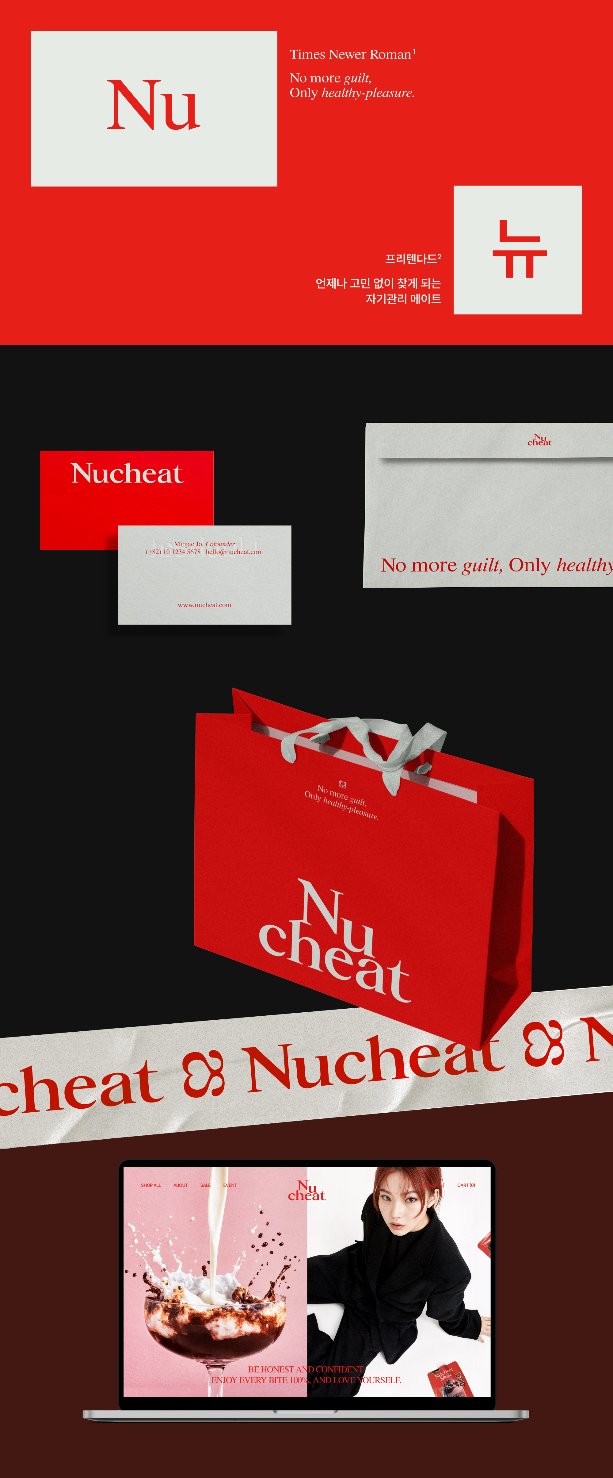
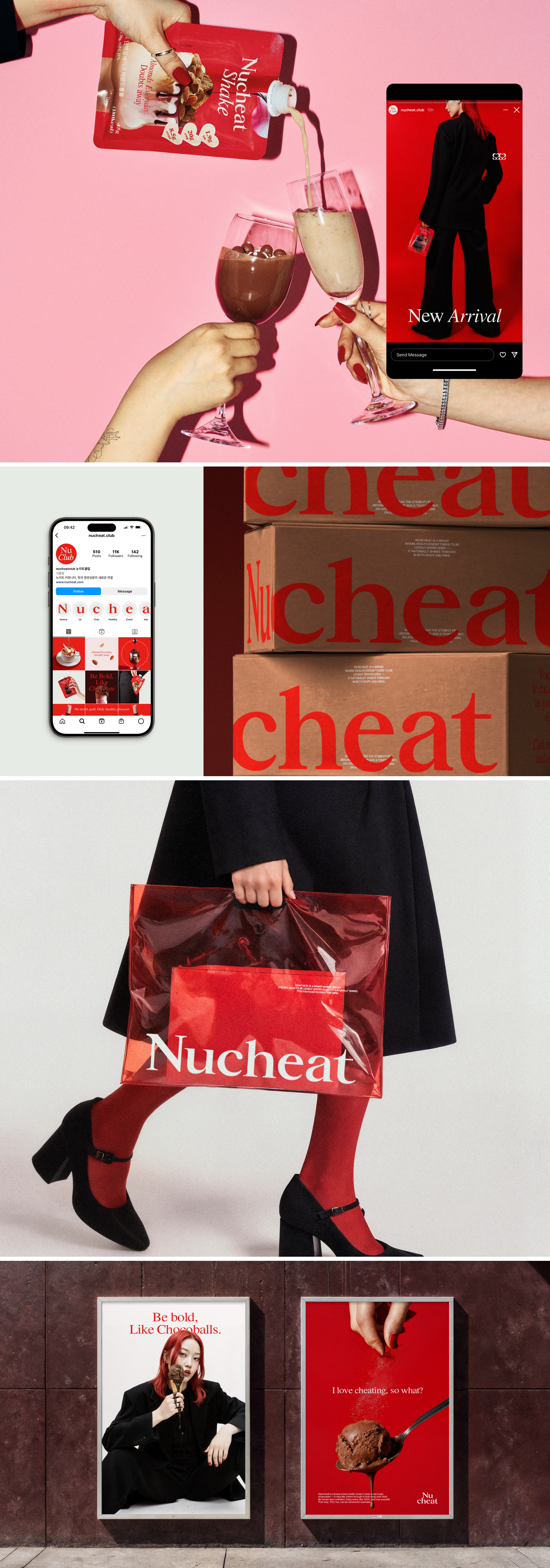
Newcheat is a wellness lifestyle brand developed for entry into the protein shake market. We led the entire branding process — from naming, identity, and positioning to the packaging design of its first product lineup.
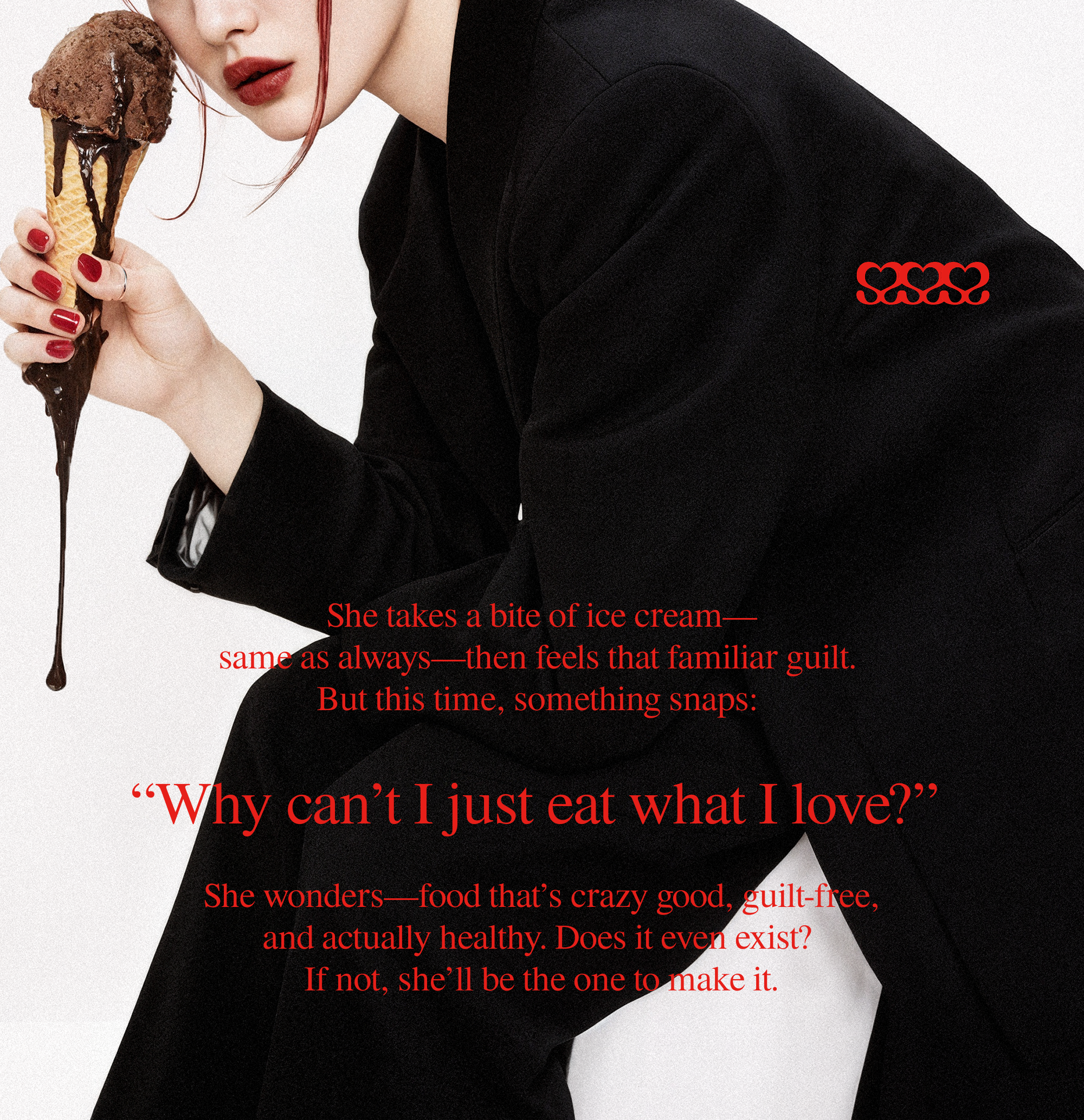
While “sweet and tasty” may seem like a simple product feature, we saw it as more than that — a chance to shift the narrative around dieting itself.
Instead of accepting the conventional, guilt-driven mindset, we reframed it through a brand lens: into one of joyful, confident, and self-directed care.
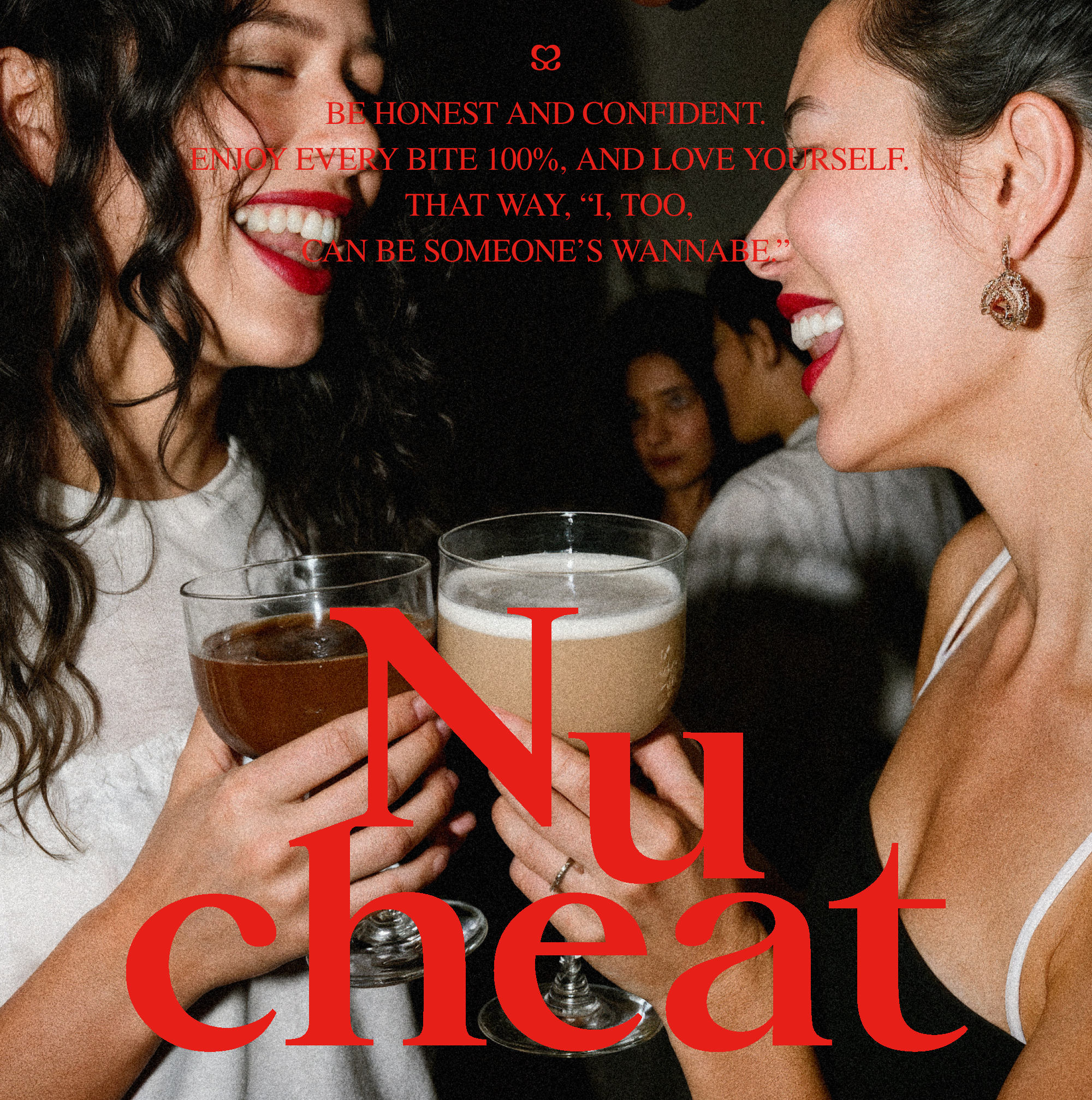
The brand philosophy is rooted in encouraging people to break free from the guilt often tied to “forbidden” foods during dieting, and to embrace what they love without hesitation.
This message is delivered through a fictional persona, “Her,” whose witty voice makes the brand feel approachable and relatable, offering both a sense of belonging and motivation.
Newcheat’s bold and stylish identity is expressed through its edgy logo and signature color, Cheat Red.
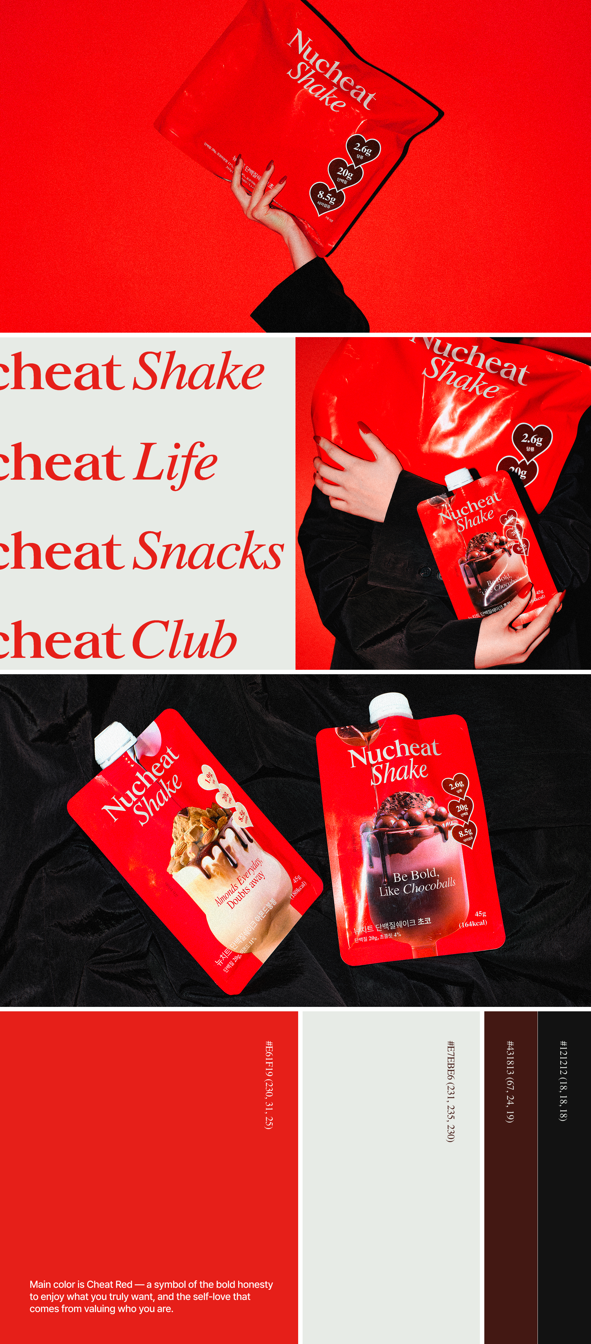
Its protein shake reinterprets the challenge of giving up dessert, offering indulgent flavor while maintaining nutritional balance.
This approach is visualized through dessert-inspired packaging and playful messaging that reflect the brand’s confident personality.
While “sweet and tasty” may seem like a simple product feature, we saw it as more than that — a chance to shift the narrative around dieting itself.
Instead of accepting the conventional, guilt-driven mindset, we reframed it through a brand lens: into one of joyful, confident, and self-directed care.
The brand philosophy is rooted in encouraging people to break free from the guilt often tied to “forbidden” foods during dieting, and to embrace what they love without hesitation.
This message is delivered through a fictional persona, “Her,” whose witty voice makes the brand feel approachable and relatable, offering both a sense of belonging and motivation.
Newcheat’s bold and stylish identity is expressed through its edgy logo and signature color, Cheat Red.
Its protein shake reinterprets the challenge of giving up dessert, offering indulgent flavor while maintaining nutritional balance.
This approach is visualized through dessert-inspired packaging and playful messaging that reflect the brand’s confident personality.
뉴치트는 단백질 쉐이크 시장 진입을 위해 기획된 웰니스
라이프스타일 브랜드이다. 우리는
네이밍, 아이덴티티, 포지셔닝, 첫 제품인
프로틴 쉐이크
패키지까지 브랜드 전 과정을 총괄 디자인하였다. ‘달고 맛있다’는 단순한 제품 특징이지만, 우리는
이를 식단 관리에 대한 부담스러운 인식을 ‘즐거운 자기 관리’로 바꾸는
브랜드적 해석으로 접근하였다.
브랜드 철학은 다이어트 중 금기시되는 음식에 대한 죄책감에서 벗어나, 원하는 것을 당당히 즐기는 용기와 해방감을 전하는 것이다. 이 메시지는 가상의 인물 ‘그녀’의 위트 있는 말투로 전달돼 소비자에게 친근하게 다가가며 소속감과 동기를 부여한다.
자신감 있고 세련된 무드는 엣지 있는 로고와 ‘치트 레드’ 컬러로 드러나며, 뉴치트의 당당한 개성을 표현한다. 식단 관리 중 디저트 포기를 새롭게 해석한 단백질 쉐이크는 속세의 맛에 대한 갈망을 충족시키면서도 영양 밸런스를 유지한다. 이는 패키지를 통해 디저트 같은 비주얼과 위트 있는 문구로 시각화되었다.