K-CRAFT ART BOX
brand identity|graphic, contents|movable archive box|SeMoCA(Seoul Museum of Craft Art)
brand identity|graphic, contents|movable archive box|SeMoCA(Seoul Museum of Craft Art)


SeMoCA(Seoul Museum of Craft Art) connects various values through craft. To help the public easily and intuitively understand different aspects of Korean craft, the museum launched the K-Craft Art Box project, which presents physical materials in a tangible format. The first theme of this project was the ‘White Porcelain Craft Box’. This special exhibition and archival box allows visitors to touch samples, feel their texture and material properties, and learn about them directly. Designed for flexibility and adaptability, the box is a foldable roller cabinet that is easy to move, making it possible to curate different displays based on users’ needs.
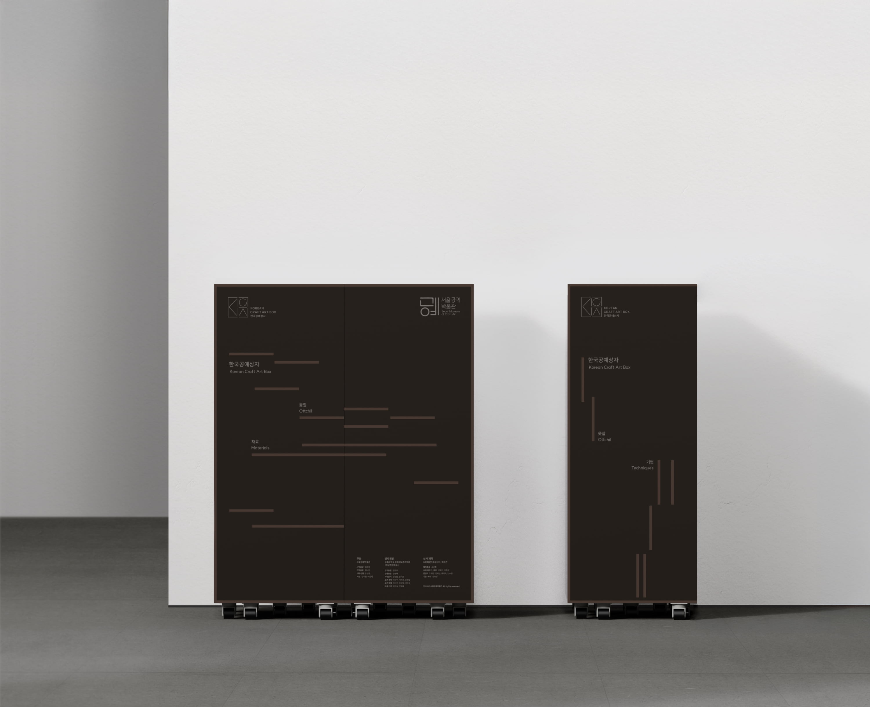
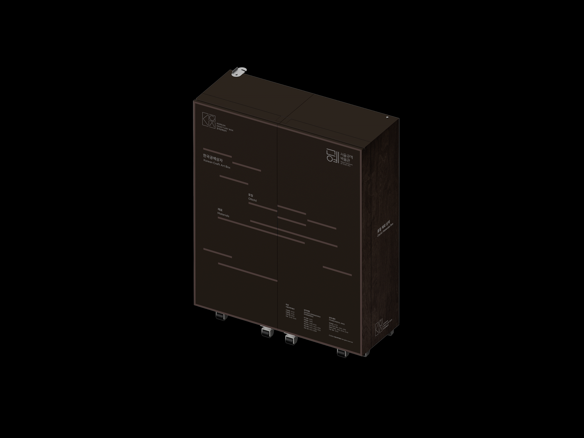
We took part in creating the second theme of the K-Craft Art Box, the ‘Ottchil Craft Box’. To expand the project further, we designed the visual identity (MI) for the K-Craft Art Box and developed the structural, interior, and exterior design, as well as the content design for the Ottchil Craft Box. We derived the line graphic motif from the values that the SeMoCA and the K-Craft Art Box aim to convey, as well as the unique characteristics of the craft box itself. This motif represents a timeline that connects the past and present, while also symbolizing the functional role of the craft box in linking craft and its audience. The visual identity (MI) was designed using a line motif, which is a combination of the English initials for “Korean Craft Art.” The separated line elements represent raw materials coming together as the foundation of craft. The open spaces between the lines symbolize the craft box as a container that preserves and showcases the essence of craftsmanship. The MI is highly flexible and can be rearranged depending on its application.
The linear elements of the MI are also applied as graphic details on the exterior of the box. The boxes are designed with two themes (material and technique), and their graphics can be varied according to the specific type of box. The exhibition content also utilizes the line graphic motif, reflecting the opening and folding characteristics of the craft box through a sliding UI system.
서울공예박물관은 공예를 통해 다양한 가치를 연결하는 박물관이다. 박물관은 대중들에게 쉽고 직관적으로 한국공예의 다양한 요소를 전달하기 위해 실물자료로 구현하기 위해 ‘한국공예상자K-Craft Art Box’ 프로젝트를 진행하고자 하였고, 프로젝트의 첫 테마로 ‘백자공예상자’를 선보였다. 관람객이 표본을 직접 만져보면서 질감, 물성을 느끼고, 표본이 지닌 정보를 습득할 수 있도록 하는 전시 관람 및 아카이브용 상자로, 공간적인 제약이 적으면서 이용자의 수요에 따른 다양한 큐레이션이
가능하도록 ‘이동이 가능한’ 접이식 롤러 캐비닛 형태를 띄고 있다.
우리는 한국공예상자의 두 번째 테마인 ‘옻칠공예상자’를 제작하게 되었다. 프로젝트의 확장성을 위해 한국공예상자의 MI를 디자인하고, 옻칠공예상자 구조 및 내,외부 디자인과 콘텐츠 디자인을 진행하였다. 서울공예박물관과 공예상자가 관람객에게 전달하고자 하는 가치와, 공예상자의 특성에서 그래픽 모티프를 도출하였다. 이는 과거와 현재를 잇는 타임라인이 되기도 하고, 공예와 관객을 이어주는 공예상자의 기능적 가치를 나타내기도 한다. MI는 라인 모티프를 활용해 제작되었다. 이는 ‘한국공예’의 영어 약자를 조합한 형태이며, 선적 요소로 분리된 형태들은 재료들이 모여 공예의 기초가 됨을 나타낸다. 분리된 듯 열려 있는 공간은 공예의 본질을 온전히 보존하고 담아내는 공예상자를 상징한다. MI는 사용처에 따라 배열을 바꿔 사용할 수 있는 확장성을 가지고 있다.
MI의 선적 요소들은 상자 외관의 그래픽 요소로 작용한다. 상자는 두 가지 테마로 제작되었는데,(재료, 기법) 상자의 종류에 따라 그래픽을 다양하게 베리에이션 하여 사용할 수 있다. 전시 관람 콘텐츠도 라인 그래픽 모티프를 활용했으며, 슬라이딩 UI 방식을 통해 접고 펼쳐지는 공예상자의 특징을 반영하였다.