HERE
holistic project|branding, product|dual agent fire extinguisher|I am here
holistic project|branding, product|dual agent fire extinguisher|I am here


‘HERE’ is an R&D project aimed at developing a new type of fire extinguisher that can be easily used by anyone in emergency situations.
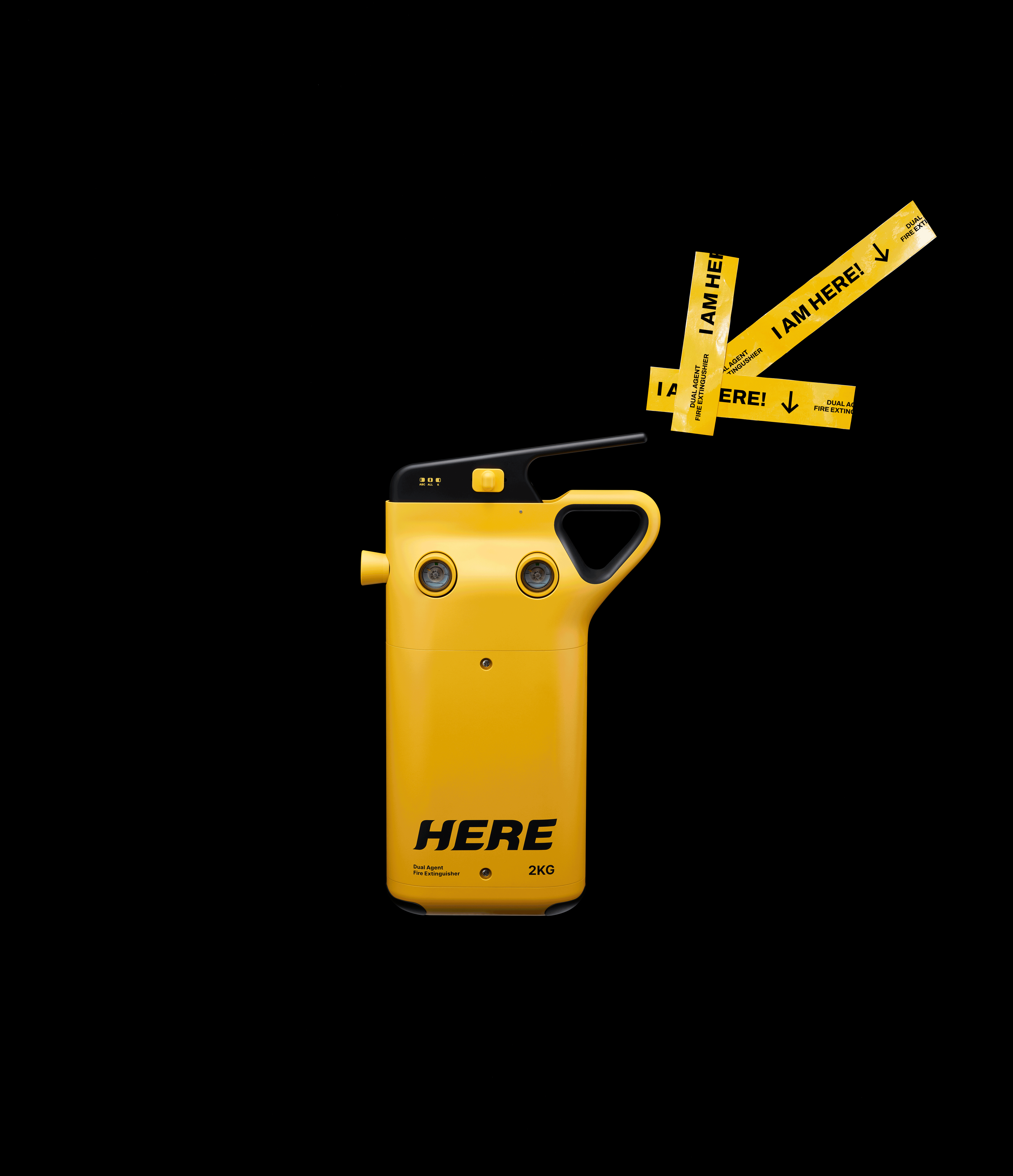
To reduce the complexity of selecting extinguishing agents and enable rapid response, ABC and K-class agents were integrated into a single product.
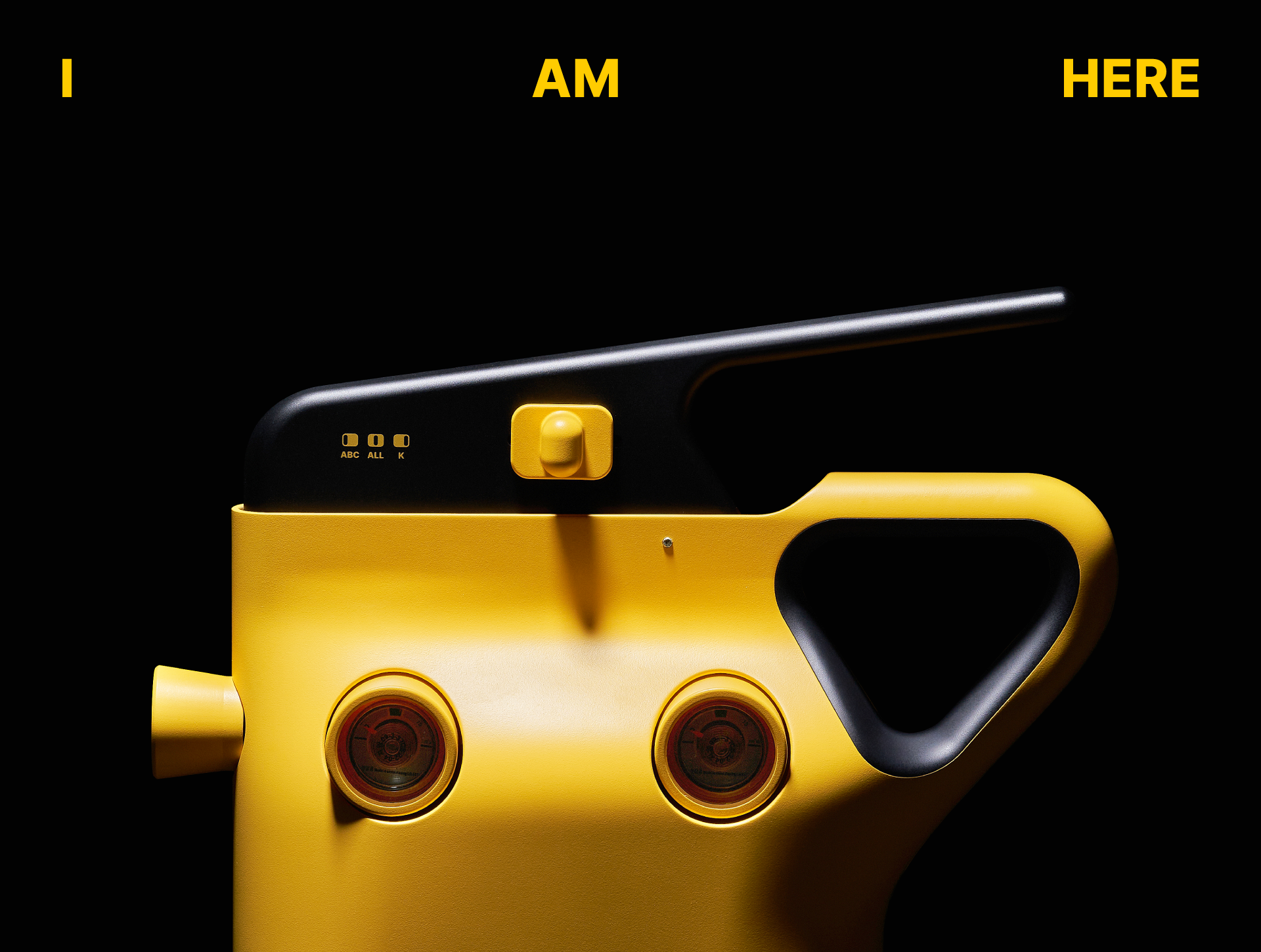
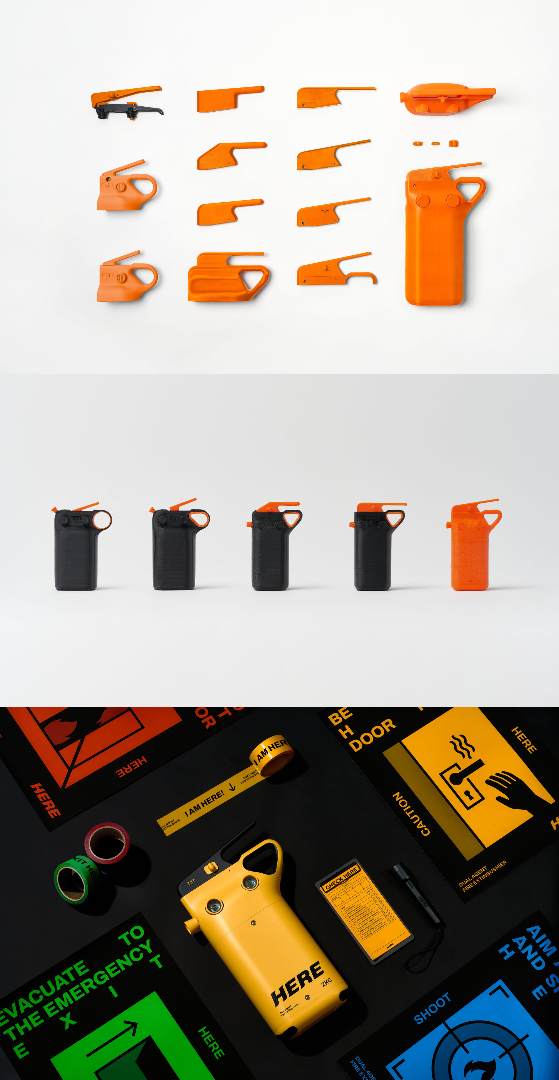
Through low-light testing and real-use scenarios we developed a form that can be recognized instantly and operated without hesitation. An intuitive switch and handle minimize decision-making in urgent situations.
A highly visible yellow color was applied to ensure quick recognition in dark environments Inspired by color systems used to distinguish fire extinguishing agents, the design balances visibility with functional meaning.
Beyond functionality, the product is designed as a signal of presence in emergencies. The name ‘HERE’ and its extended message, “I AM HERE.”,
provide a clear and immediate answer—allowing users to locate the extinguisher without hesitation. The bold logo and signage-inspired graphic language enable instant recognition leading to intuitive interaction that supports rapid judgment and action.
To reduce the complexity of selecting extinguishing agents and enable rapid response, ABC and K-class agents were integrated into a single product.
Through low-light testing and real-use scenarios we developed a form that can be recognized instantly and operated without hesitation. An intuitive switch and handle minimize decision-making in urgent situations.
A highly visible yellow color was applied to ensure quick recognition in dark environments Inspired by color systems used to distinguish fire extinguishing agents, the design balances visibility with functional meaning.
Beyond functionality, the product is designed as a signal of presence in emergencies. The name ‘HERE’ and its extended message, “I AM HERE.”,
provide a clear and immediate answer—allowing users to locate the extinguisher without hesitation. The bold logo and signage-inspired graphic language enable instant recognition leading to intuitive interaction that supports rapid judgment and action.
‘HERE’는 위기 상황에서 누구나 쉽게 사용할 수 있는 신개념 소화기 개발을 목표로 한 R&D 프로젝트이다. 화재 시 약제 선택의 복잡함을 줄이고, 빠르고 정확한 대응을 위해 ABC급과 K급 이중 소화약제를 하나의 제품에 통합하였다.
우리는 실제 저조도 환경과 다양한 사용 시나리오 테스트를 통해 가장 빠르게 인지되고 즉각적으로 작동할 수 있는 형태를 도출하였다. 직관적인 스위치와 손잡이 구조는 긴박한 상황 속에서도 사용자의 판단을 최소화한다.
컬러는 어두운 환경에서도 빠른 인지를 유도하기 위해 시인성이 높은 옐로우를 적용하였다. 화재 대응 소화약제 구분에 사용되는 컬러 체계에서 착안해 기능성과 가시성을 동시에 확보하였다.
또한 이 제품은 단순한 기능을 넘어, 위기 상황에서 ‘존재를 알리는 신호’가 되도록 브랜딩을 설계하였다. ‘HERE’라는 네이밍과 확장된 메시지 “I AM HERE.”는 사용자가 소화기의 위치를 망설임 없이 인지하도록, 존재 자체로 명확한 신호를 전달한다. 볼드한 로고와 표지판에서 차용한 그래픽 언어는 복잡한 해석 없이도 즉각적인 인지를 유도하며, 빠른 판단과 행동으로 이어지는 직관적인 사용 경험을 완성한다.