HERE
inquiry project|branding & product|dual agent fire extinguisher|I am here
inquiry project|branding & product|dual agent fire extinguisher|I am here

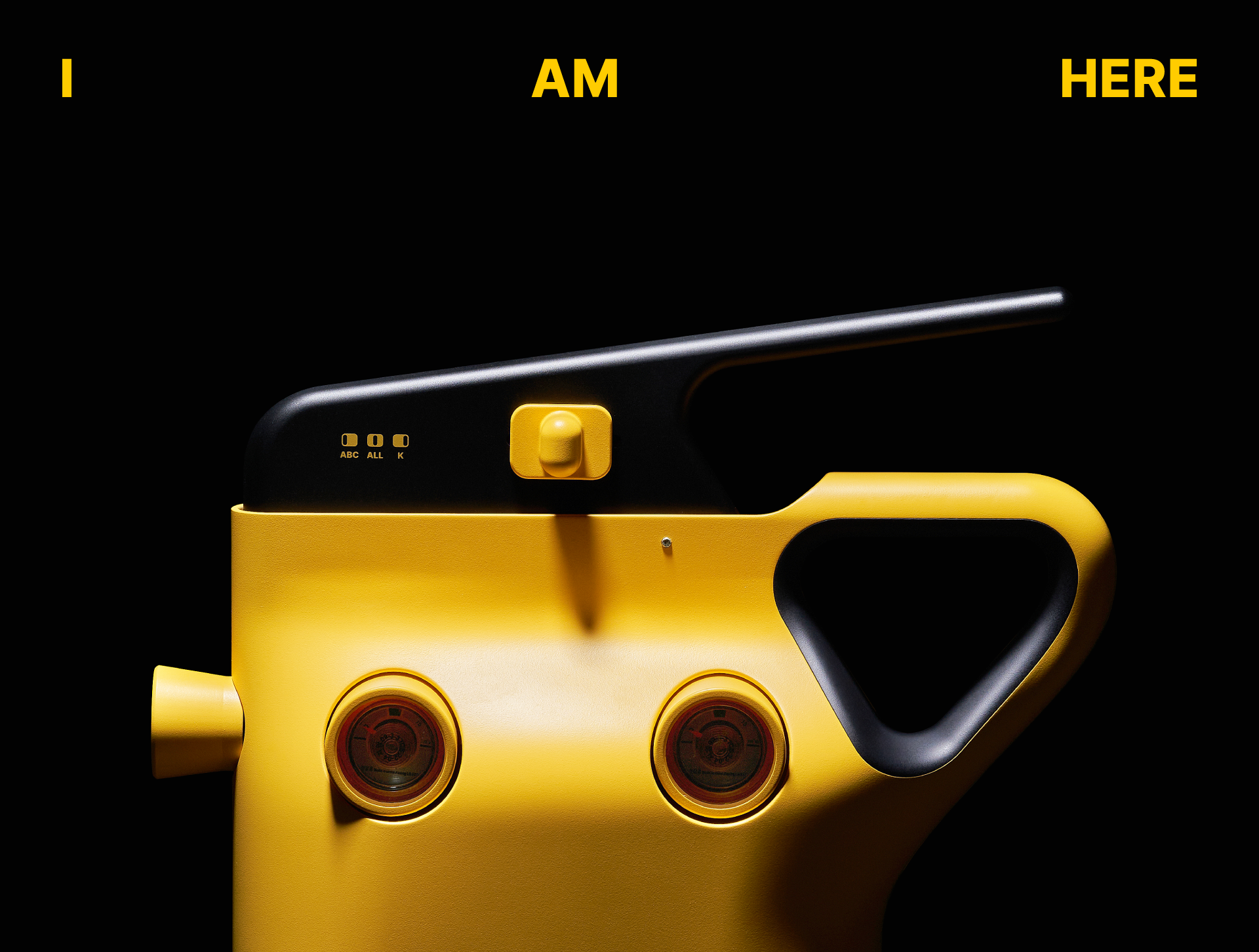

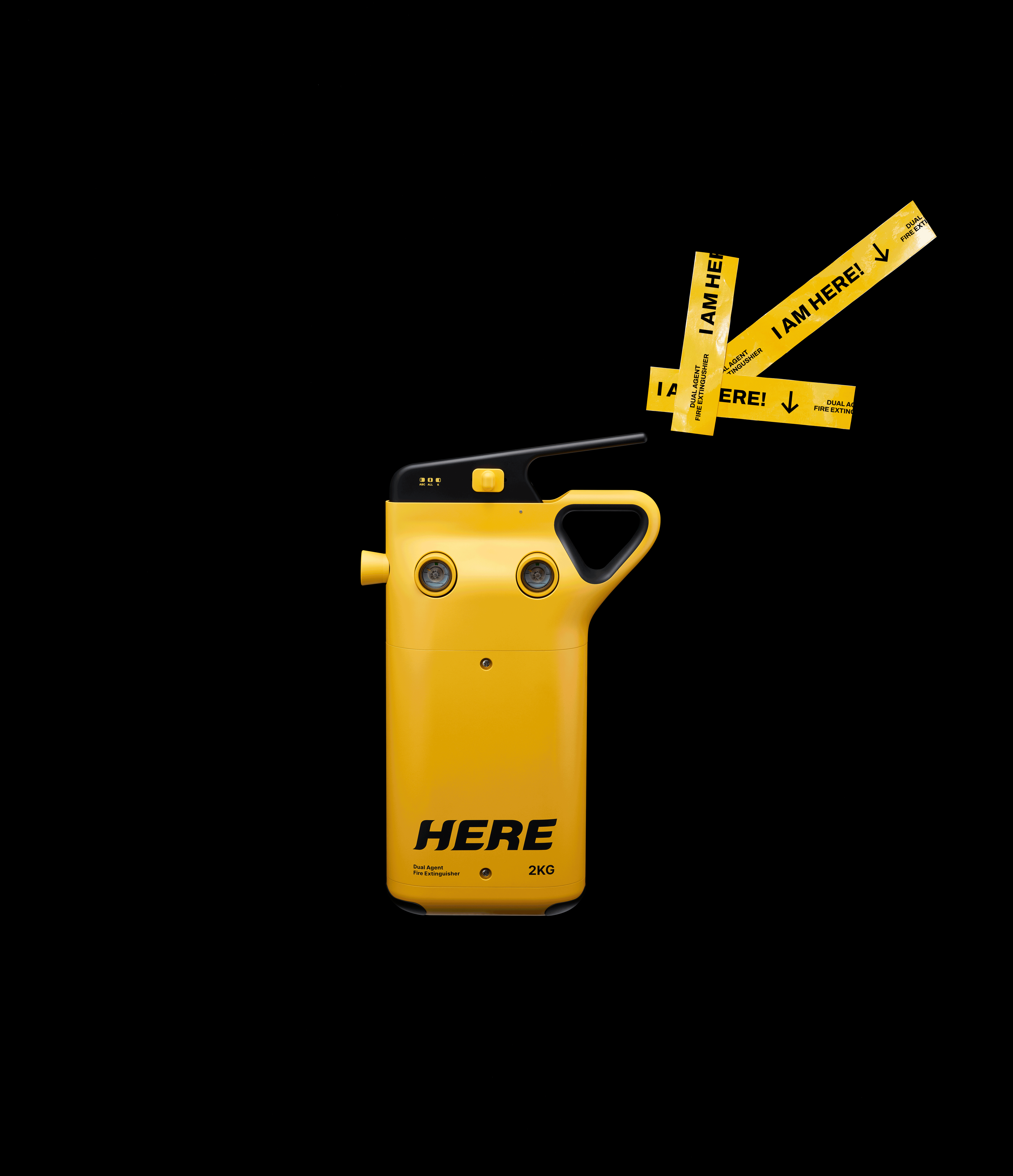
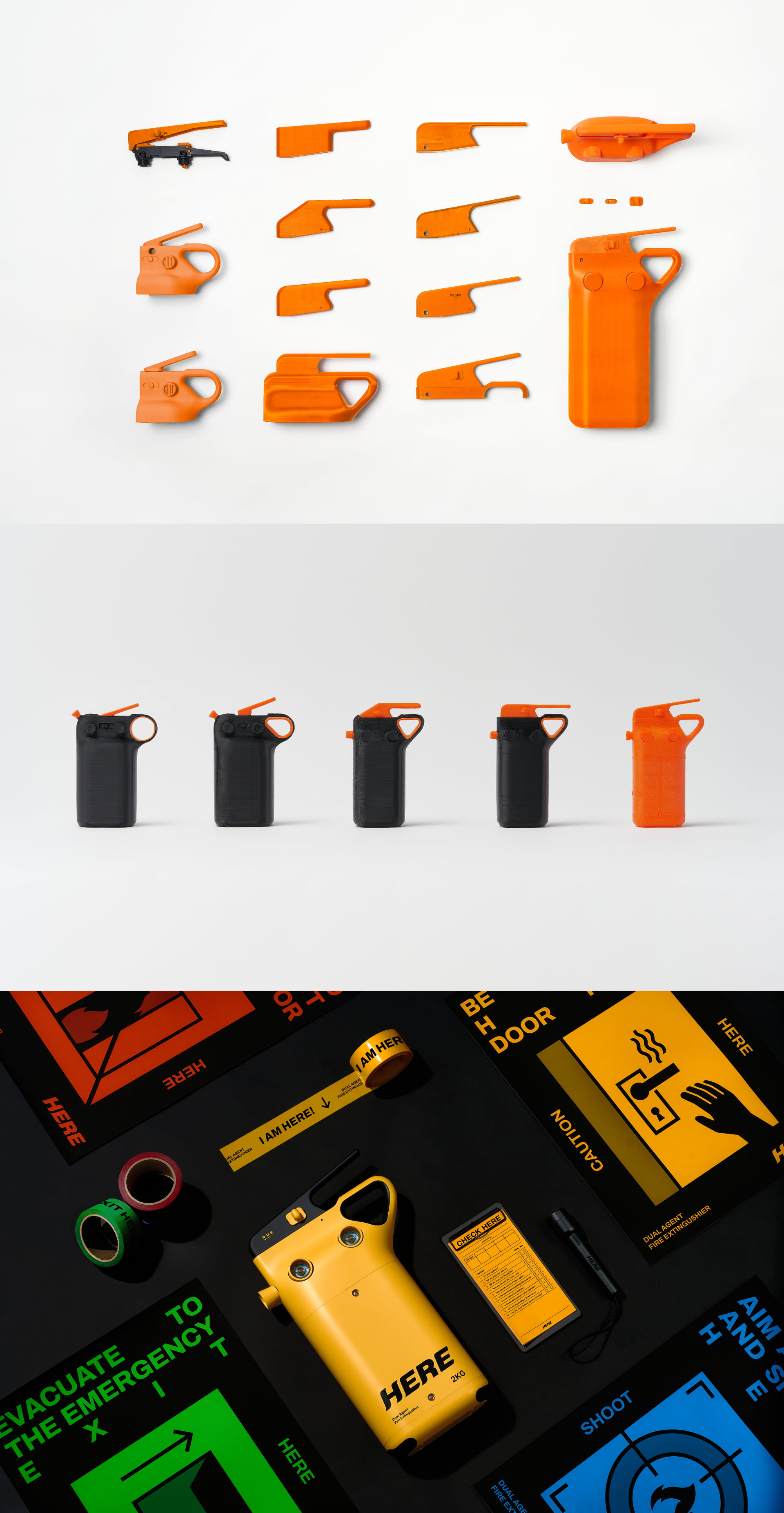
‘HERE’ is a fire extinguisher project designed so anyone can use it in an emergency. To reduce the complexity of choosing an agent during a fire and to support fast, accurate response, it combines dual extinguishing agents suitable for both ABC- and K-class fires in a single unit.
We conducted hands-on tests in low-light conditions and real-use scenarios, and refined a form that is immediately legible and quick to operate.
The bright yellow body stands out in dark environments, and the intuitive switch-and-handle layout minimizes user confusion.
We also developed the branding to offset the product’s unfamiliarity. The assertive message “I AM HERE” and a bold logotype convey trust under stress, while a signage-inspired graphic system delivers a simple, intuitive user experience.
‘HERE’는 위기 상황에서 누구나 쉽게 사용할 수 있는 소화기를 목표로 한 프로젝트다. 화재 시 약제 선택의 복잡함을 줄이고, 빠르고 정확한 대응을 돕기 위해 ABC급과 K급의 이중 소화약제를 하나의 제품에 담았다.
우리는 실제 저조도 환경과 사용 시나리오 테스트를 직접 진행하며 가장 명확하게 인식되고, 빠르게 작동할 수 있는 형태를 완성하다. 밝은 옐로 컬러는 어두운 환경에서도 즉각적으로 눈에 띄며, 직관적인 스위치와 손잡이 구조는 사용자의 혼란을 최소화한다.
또한 제품의 생소함을 보완하기 위해 브랜딩을 함께 진행했다. “I AM HERE”라는 강렬한 메시지와 볼드한 로고는 위기 상황 속 강력한 신뢰를 느끼게 하며, 표지판에서 차용한 그래픽 언어는 단순하고 직관적인 사용 경험을 완성한다.
우리는 실제 저조도 환경과 사용 시나리오 테스트를 직접 진행하며 가장 명확하게 인식되고, 빠르게 작동할 수 있는 형태를 완성하다. 밝은 옐로 컬러는 어두운 환경에서도 즉각적으로 눈에 띄며, 직관적인 스위치와 손잡이 구조는 사용자의 혼란을 최소화한다.
또한 제품의 생소함을 보완하기 위해 브랜딩을 함께 진행했다. “I AM HERE”라는 강렬한 메시지와 볼드한 로고는 위기 상황 속 강력한 신뢰를 느끼게 하며, 표지판에서 차용한 그래픽 언어는 단순하고 직관적인 사용 경험을 완성한다.