BEARD & BUTTER
holistic project|branding, product|shaving set for man’s day|spread and eat every morning
holistic project|branding, product|shaving set for man’s day|spread and eat every morning
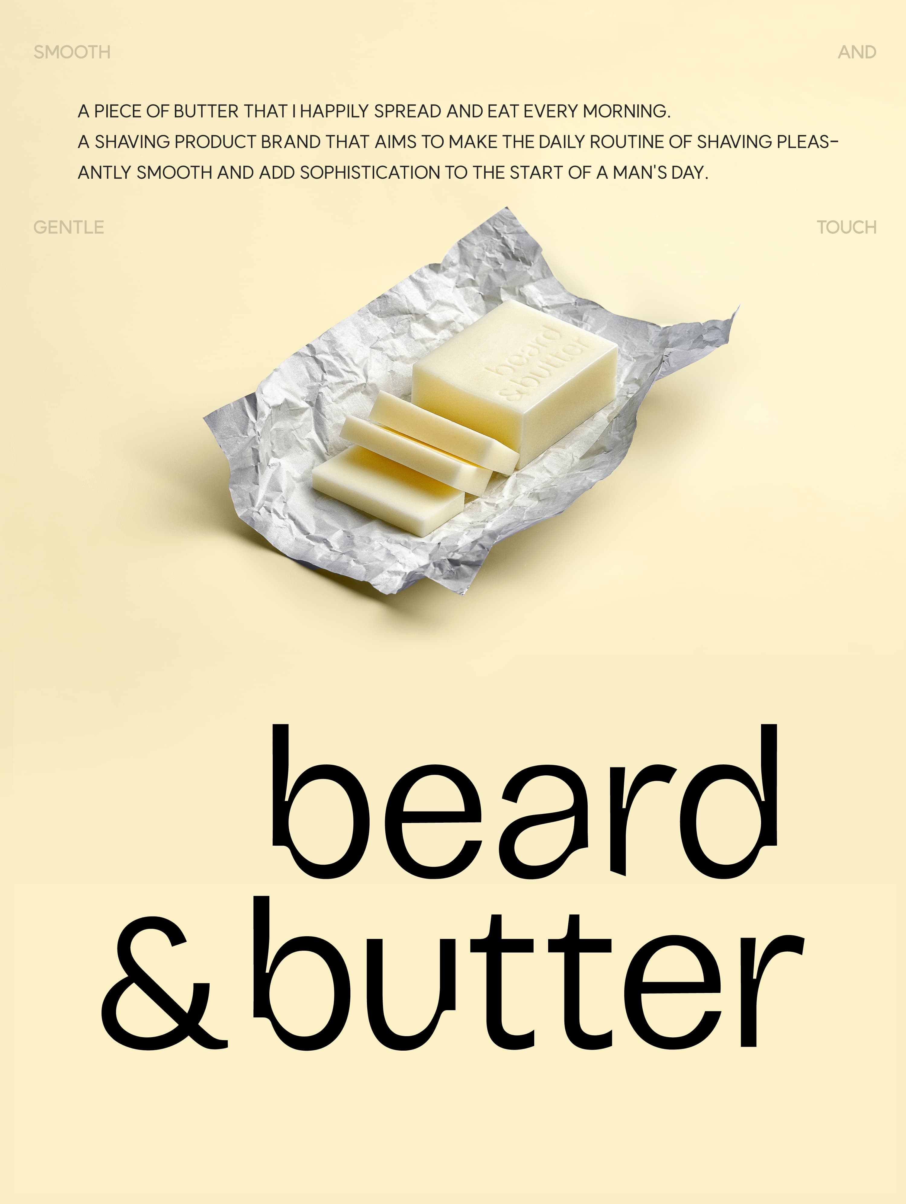



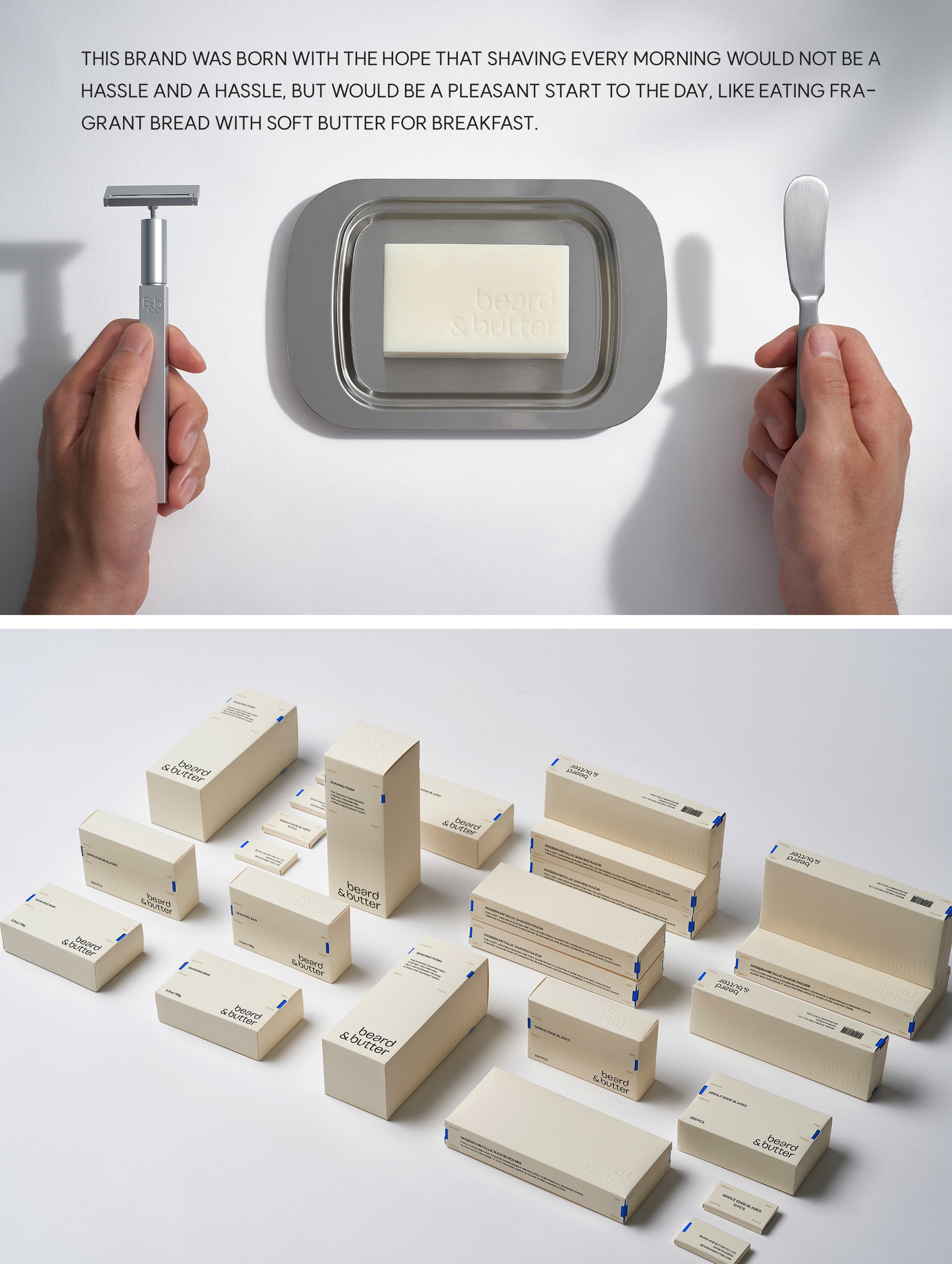
Like a slice of butter spread over warm bread in the morning, beard&butter is a shaving brand that reimagines the repetitive act of shaving as a smooth and pleasant start to the day. Just as spreading butter creates a simple moment of comfort, the brand transforms what can often feel like a tedious routine into a refreshing and effortless experience.
The name beard&butter combines beard, a symbol of men’s grooming, with butter, which evokes the image of a soft and relaxed morning. Moving away from the strong and aggressive imagery often associated with traditional shaving brands, beard&butter proposes a sophisticated and fashionable grooming experience. The abbreviated form, “B&b,” is applied throughout the logo and product details, functioning as a key visual element of the brand identity.
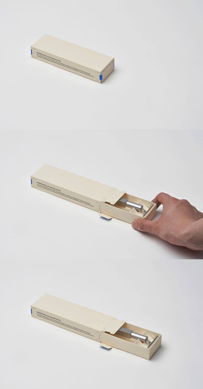
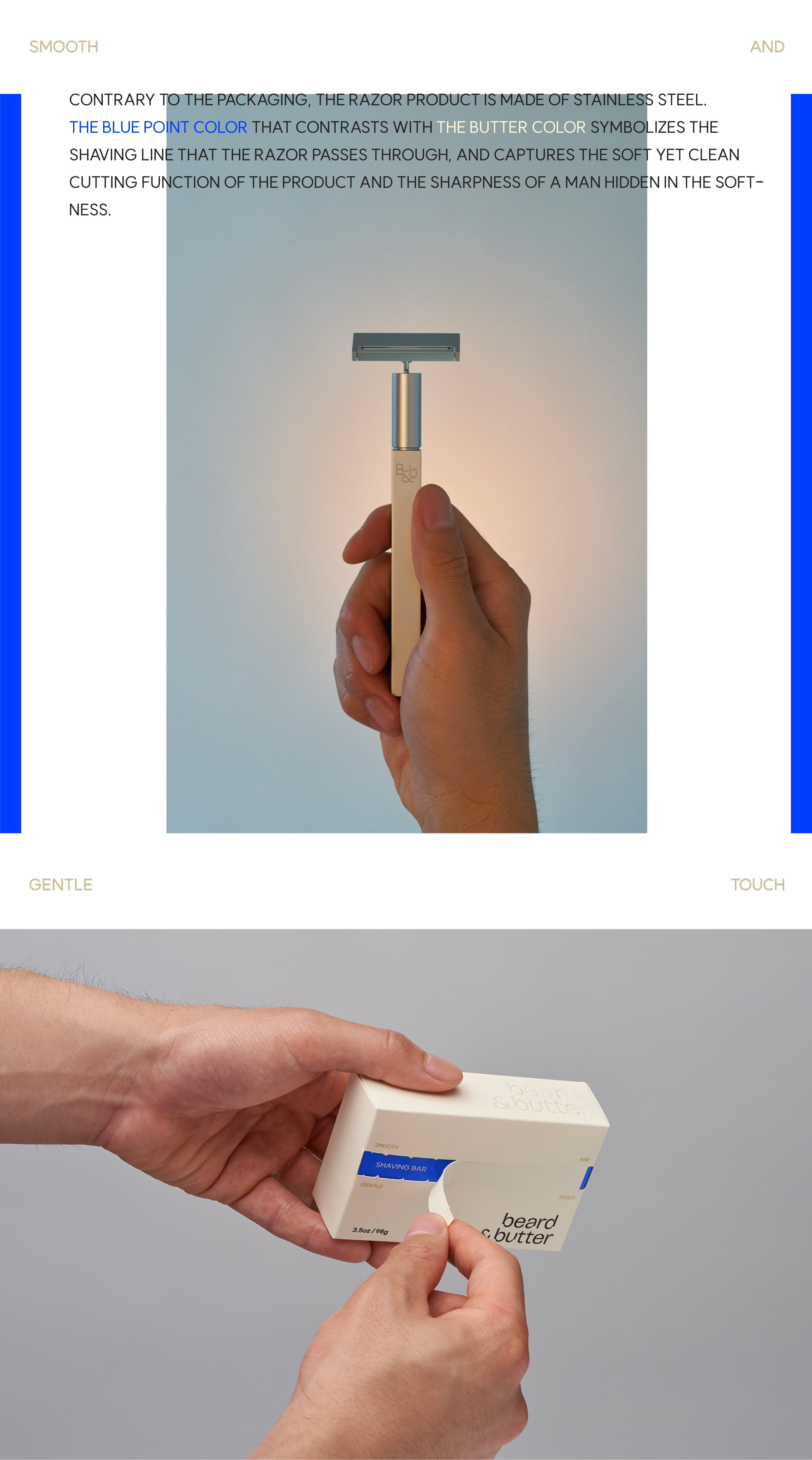
The product consists of a stainless-steel razor with a replaceable blade system. The durable and hygienic metal construction conveys reliability as a precision grooming tool, while the easily replaceable blades ensure a consistently clean and fresh shaving experience. Inspired by the effortless simplicity of spreading butter, the intuitive blade replacement mechanism makes the daily grooming routine simple and convenient.
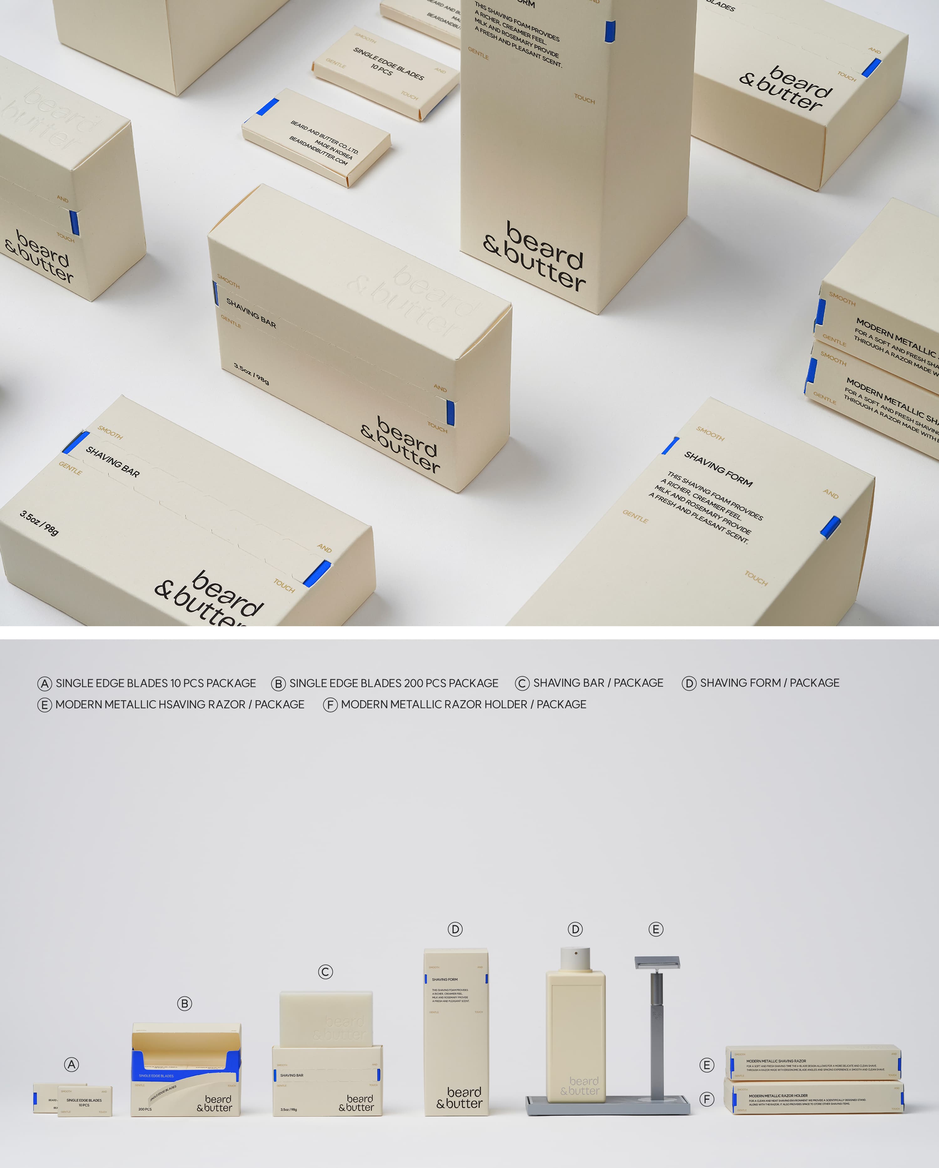
The packaging communicates the brand concept through soft butter-inspired colors and a clean, minimal form. The contrast between the warm butter tone and the cool stainless steel visualizes a brand identity where softness and sharpness coexist. A blue accent color symbolizes the path of the razor blade, expressing both the product’s smooth shaving experience and precise cutting performance, while hinting at the quiet strength beneath its gentle appearance.
The name beard&butter combines beard, a symbol of men’s grooming, with butter, which evokes the image of a soft and relaxed morning. Moving away from the strong and aggressive imagery often associated with traditional shaving brands, beard&butter proposes a sophisticated and fashionable grooming experience. The abbreviated form, “B&b,” is applied throughout the logo and product details, functioning as a key visual element of the brand identity.
The product consists of a stainless-steel razor with a replaceable blade system. The durable and hygienic metal construction conveys reliability as a precision grooming tool, while the easily replaceable blades ensure a consistently clean and fresh shaving experience. Inspired by the effortless simplicity of spreading butter, the intuitive blade replacement mechanism makes the daily grooming routine simple and convenient.
The packaging communicates the brand concept through soft butter-inspired colors and a clean, minimal form. The contrast between the warm butter tone and the cool stainless steel visualizes a brand identity where softness and sharpness coexist. A blue accent color symbolizes the path of the razor blade, expressing both the product’s smooth shaving experience and precise cutting performance, while hinting at the quiet strength beneath its gentle appearance.
매일 아침 행복하게 펴서 먹는 버터 한 조각처럼. beard&butter 는 반복되는 면도의 일상을 부드럽고 기분 좋은 하루의 시작으로 제안하는 면도 제품 브랜드이다. 부드러운 버터 한 조각을 빵 위에 펴 바르듯, 번거롭게 느껴질 수 있는 면도 과정을 산뜻하고 매끄러운 경험으로 재해석하였다.
beard&butter는 남성 그루밍의 시작점인 beard와 부드럽고 여유로운 아침의 이미지를 담은 butter를 조합한 네이밍이다. 기존 면도기 브랜드가 강조해 온 강하고 날카로운 이미지에서 벗어나, 세련되고 패셔너블한 무드의 그루밍 경험을 제안한다. 브랜드 약어인 "B&b"는 로고와 제품 디테일 전반에 적용되어 브랜드의 핵심 시각 요소로 기능한다.
제품은 스테인리스 스틸 소재의 면도기와 교체형 칼날 구조로 구성된다. 견고하고 위생적인 금속 소재는 정교한 면도 도구로서의 신뢰감을 주며, 손쉽게 교체할 수 있는 칼날은 언제나 새롭고 깔끔한 사용 경험을 가능하게 한다. 필요한 만큼 꺼내 사용하는 버터처럼, 직관적인 칼날 교체 방식은 아침 그루밍 과정을 더욱 간편하게 만든다.
패키지는 버터를 연상시키는 부드러운 컬러와 간결한 형태로 브랜드 콘셉트를 직관적으로 전달한다. 따뜻한 버터 컬러와 차가운 스테인리스 스틸의 대비는 부드러움과 날카로움이 공존하는 브랜드 정체성을 시각화한다. 파란색 포인트 컬러는 면도기가 지나가는 면도 라인을 상징하며, 부드러운 사용감과 정교한 커팅 성능, 그리고 그 안에 담긴 절제된 강인함을 표현한다.
beard&butter는 남성 그루밍의 시작점인 beard와 부드럽고 여유로운 아침의 이미지를 담은 butter를 조합한 네이밍이다. 기존 면도기 브랜드가 강조해 온 강하고 날카로운 이미지에서 벗어나, 세련되고 패셔너블한 무드의 그루밍 경험을 제안한다. 브랜드 약어인 "B&b"는 로고와 제품 디테일 전반에 적용되어 브랜드의 핵심 시각 요소로 기능한다.
제품은 스테인리스 스틸 소재의 면도기와 교체형 칼날 구조로 구성된다. 견고하고 위생적인 금속 소재는 정교한 면도 도구로서의 신뢰감을 주며, 손쉽게 교체할 수 있는 칼날은 언제나 새롭고 깔끔한 사용 경험을 가능하게 한다. 필요한 만큼 꺼내 사용하는 버터처럼, 직관적인 칼날 교체 방식은 아침 그루밍 과정을 더욱 간편하게 만든다.
패키지는 버터를 연상시키는 부드러운 컬러와 간결한 형태로 브랜드 콘셉트를 직관적으로 전달한다. 따뜻한 버터 컬러와 차가운 스테인리스 스틸의 대비는 부드러움과 날카로움이 공존하는 브랜드 정체성을 시각화한다. 파란색 포인트 컬러는 면도기가 지나가는 면도 라인을 상징하며, 부드러운 사용감과 정교한 커팅 성능, 그리고 그 안에 담긴 절제된 강인함을 표현한다.